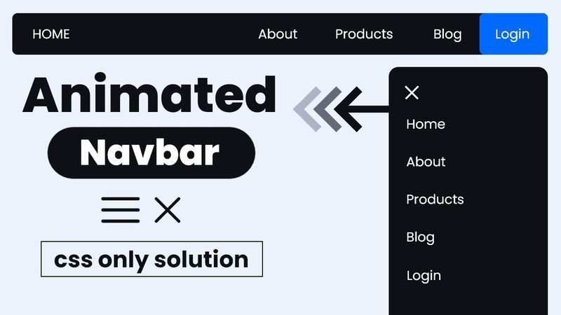
Create a RESPONSIVE NAVBAR with sidebar animation (CSS ONLY)
Informasi unduhan dan detail video Create a RESPONSIVE NAVBAR with sidebar animation (CSS ONLY)
Pengunggah:
Coding2GODiterbitkan pada:
22/2/2024Penayangan:
127.6KDeskripsi:
In this video, the creator walks through building a responsive navigation bar with a hamburger menu and a sliding sidebar using only HTML and CSS flexbox. They explain the structure of the HTML markup, how CSS flexbox and media queries enable horizontal and vertical alignment, and how a simple checkbox input paired with the :checked pseudo-class controls the open/close state of the sidebar. Visual assets such as Google Icons are used for the menu and close buttons. The tutorial emphasizes avoiding JavaScript, showing how CSS alone can deliver a dynamic, mobile‑friendly navigation experience.
Video serupa: Create a RESPONSIVE NAVBAR with sidebar animation
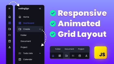
Build a Responsive Sidebar Menu with Animated Dropdowns | HTML CSS JavaScript Project

Pelajari CSS GRID-AREA untuk Membangun LAYOUT BENTO yang Menakjubkan

Viral Horizontal Reel Editing 2026 | Premiere Pro Tutorial

How to Edit Trending Viral Reels in After Effects- Complete Guide 2026-Hindi

Make High-Earning Faceless Videos With Canva for Free