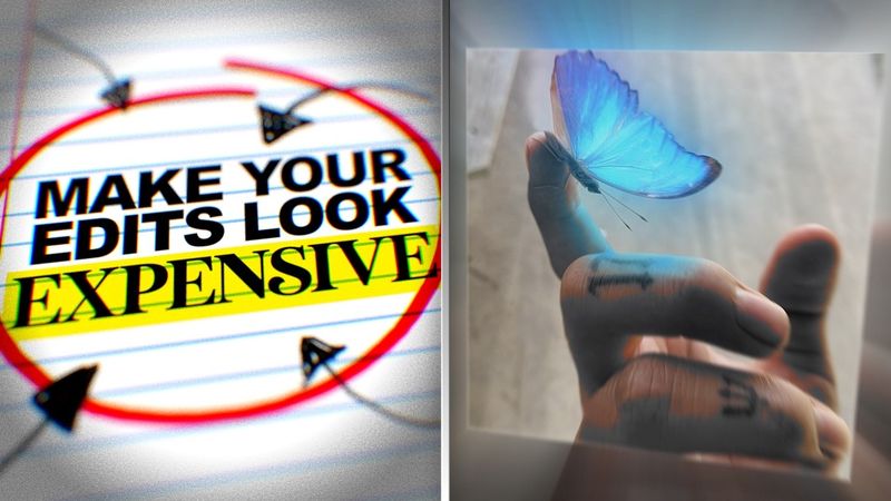
Make Your Edits Look EXPENSIVE (Simple Tricks)
Download information and video details for Make Your Edits Look EXPENSIVE (Simple Tricks)
Uploader:
NaughtyyJuanPublished at:
2/19/2025Views:
520.4KDescription:
Video Transcription
you ever finish an edit you watch it and think yeah this is fire but then you show it to someone else and they hit you with the yeah it's cool yeah that's the moment reality hits the problem isn't that your edit is bad is that you're biased because you made it you know how much effort you put in but the viewer they don't care about that so most people never actually fix their mistakes and what happens they get stuck making the same cheap looking edits forever
But not true, because today I'm going to show you how to make your edits look expensive.
If your edits look packed with too many effects, it's probably doing more harm than good.
Ever watched an edit and thought, wow, this looks like a million dollar ad.
And then you look at yours and it looks like it was made in Microsoft PowerPoint.
Here's the secret.
Expensive edits aren't about doing more.
They're about doing less, but better.
Think of Apple commercials.
They don't need crazy explosions or 3D text flying across the screen.
They just use clean, simple visuals with intentional motion.
And guess what?
It looks expensive, even though you can recreate it with any software.
So next time you're editing, ask yourself, do I really need this effect?
Or am I just doing it because I'm bored?
Let's talk about fonts.
I was tempted.
The fastest way to make an edit look cheap is using the wrong font.
Fonts play a bigger role in your edit than you think.
The wrong one can make it look cheap while the right one just makes it instantly more polished.
Here's some fonts that you can use.
If your edit looks flat and lifeless, it's probably your color grading.
Here's the before and after.
See the difference?
The first one looks like a high school project and the second one looks like a cinematic film.
Here's how you fix it.
Use adjustment layers to tweak your brightness, contrast, and color balance.
And if you really want to flex, add subtle film grain, some halation, and even an overlay.
Also, that was more for camera film videos.
But if you make transition edits like I also do, adding a little bit of glow and S curves adjustment and sharpen, it really makes your edits pop a little bit more because it's not really about color grading.
It's more about actually making your visuals look better.
That's some free game right there, by the way.
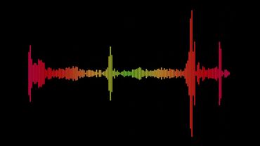
Sound design.
This one is underrated because if your edit doesn't have sound effects, it's missing so much impact.
See how much more expensive that feels?
Even the smallest sound effects.
Swishes for motion, basses for impact, subtle clicks for UI movements.
They all make the edit feel more immersive.
Even if you're just working with types, adding a switch sound when it appears tricks the brain into thinking it's more polished.
all right before we jump into the next step i've got something big for you guys i'm launching beyond the cut a private telegram channel where i'll teach you exactly how to edit like a pro and turn it into a real career i've had a ton of requests for this and here's the deal when i open direct mentorship there will only be 10 spots available
But even before that, I'll be dropping exclusive tips on editing, creativity, and making money as an editor.
Plus live streams, Q&As, and maybe even givingaways.
And here's the best part.
The first people to join will get this crazy text animation pack for free.
So if you want to head start, don't wait.
This is the only place I'll be giving this opportunity.
If you're serious about editing and making money from it, click the link in the description and join now.
Back to the video.
Motion.
You ever see an edit where the movement feels weird, choppy, and stiff?
That's because motion needs to be smooth.
Fix it by using EZEs and tweaking the graph editor to get that nice flow.
Or you can check out my video where I teach you how to do smooth movements.
And to end the video, I just want to say that Beyond the Cut is now live.
As I promised, I gave away my text animation for free.
So make sure to come when you join.
I want to start this year by helping out some of y'all with some editing game and especially those 10 of y'all who are going to be working with me closely on your editing journey.
Again, the link is in the description.
Thanks for watching and I'll see you guys next time.
Deuces.
I've been feeling like I am the one.
Ain't nobody on this level.
I've been on.
They ain't living like this.
I'm king of the hill.
I just be counting my stacks.
Don't really fuck with you.
I come off like Bill.
Yeah, just like that.
Similar videos: Make Your Edits Look EXPENSIVE
Шкала навыков с помощью HTML & CSS шаг за шагом || using pure HTML & CSS step by step
Футаж №193 Звуковые волны
Overlay для монтажа | Эффект для видео
Editing Motion Graphics Reels in Premiere Pro – Clean & Minimal Style
Как Посмотреть Понравившиеся Видео На Youtube | Шаг За Шагом