HTML & CSS Full Course for free 🌎
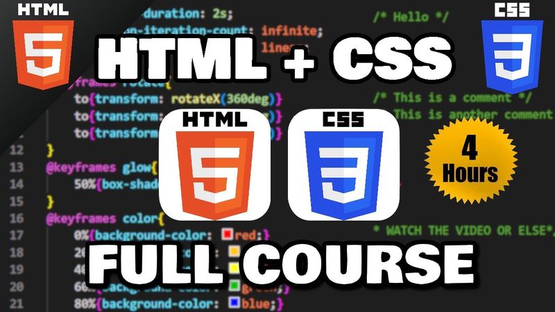
Download information and video details for HTML & CSS Full Course for free 🌎
Uploader:
Bro CodePublished at:
5/31/2023Views:
3.8MDescription:
Video Transcription
How's it going, everybody?
In this series, I'm going to show you everything you need to know to get started working with HTML.
Then a little bit later on, we'll cover CSS.
So why don't you go ahead and sit back, relax and enjoy the show.
Hey, if you enjoy my videos, please be sure to subscribe because subscribing is free.
Just like how this video is free.
Help me out.
Yes, I'm guilt tripping you.
That is all.
Why should you learn HTML?
In today's age, people spend way too much time on the internet.
Myself included, unfortunately.
Knowing how to create or otherwise manage a website isn't a bad thing to know.
Heck, add it to your resume.
It really can't hurt.
Even if you're not interested in web development as a career, almost every business has some sort of online presence.
Knowing how to manage that online presence could convince a potential employer to hire you over somebody else.
So why not?
HTML is an acronym for hypertext markup language.
The general idea is that certain types of tags, also known as markup, is used to convey to a web browser how some content should be displayed.
Usually tags are in pairs, with some content sandwiched between them.
Header tags are typically used for titles.
P tags are used for paragraphs of text.
A tags are used for hyperlinks.
HTML adds structure to a webpage.
If we were building a house, you could say that HTML is the foundation, the skeletal structure to support all content on a website.
Then there's CSS.
CSS means Cascading Style Sheets.
It's a language that adds style to a webpage.
In our house analogy, CSS would be equivalent to the decorations, design, and colors of the interior.
To begin working with HTML and CSS, you'll need a modern web browser.
You can use Google Chrome, Firefox, Microsoft Edge, Safari.
Those are all fine.
You'll also need a text editor as well, such as VS Code.
It's free software that functions as a workbench for us to write code.
In this next part, I'll show you how we can download and install VS Code.
To download VS Code, head to this website, code.visualstudio.com.
Look for whatever operating system you're using and download that version.
I'm running Windows.
I will download the Windows version.
Then I will open it when it's done.
Accept the agreement.
Yes, I did read it that fast.
Next.
Next.
I'll create a desktop icon.
Next.
Install.
Launch Visual Studio Code and finish.
We need a folder to hold all of the documents related to our website.
Go to Open Folder.
I'll place this folder on my desktop.
New Folder.
I'll name this folder Website.
Select Folder.
There we go.
We are now within our website folder.
I'm going to create a new file.
I will name this file index.html.
Whatever your homepage is going to be, I would recommend naming it index.html.
Most servers return the index file as the homepage.
So it would be good practice for us to name the homepage index.
Now what we're going to do is install the Live Server extension.
Go to Extensions.
Look up Live Server.
and install.
Basically what this does is that when you update your HTML file, if you have a web browser open, it's going to update automatically.
It'll save you some time.
Alright everybody, now what we're going to do is fill in our HTML file.
At the top, what we'll do is add a set of angle brackets, then type this, exclamation point, doc, type, HTML.
This is a declaration that this document is an HTML5 document, which is the most recent version.
Then we'll create a pair of HTML tags.
We'll need an opening HTML tag,
and an ending HTML tag.
You can tell that this is an ending tag because it has a forward slash.
Most tags are in groups of pairs.
That's if there's typically content between them.
This pair of HTML tags represents the root element of an HTML page.
Between these two tags, we will add a pair of head tags.
The head element contains information about your web page, such as a title.
Let's add a title to our web page.
Title, add a closing tag.
Let's set the title of our web page to be My First Website.
Now what we'll do, right click on your HTML file, then open with Live Server.
Here's our webpage.
The title says My First Website.
Just to make this easier on us, I'm going to place our webpage side by side with VS Code.
When we save any changes, we can see that update automatically.
The head element contains information about your webpage.
Whereas in the body, let's add a pair of body tags after the pair of head tags.
The body element contains visible content in your web page.
Between our body tags, let's add a pair of h1 header tags.
h1 defines a large heading.
I'll add some text.
This is an h1 heading.
I'm going to save.
That should update my HTML document automatically.
This is an h1 heading.
Let's try h2.
Add a pair of H2 header tags.
This is an H2 heading.
Let's do H3.
H3.
This is an H3 heading.
H4.
This is an H4 heading.
Then we have H5.
This is an h5 heading.
Typically header tags are used for titles or other large text.
Let's discuss paragraph tags.
If you have a paragraph of text, you can place that within a pair of p tags.
Some text goes here.
If you need some sample text to work with, if you're using VS Code, you can type lorem, then tab.
This will create some garbage text for you.
I think it's supposed to resemble Latin.
If I were to copy everything within the set of paragraph tags, then save it, paragraphs are separated with a line break.
Otherwise, if you do need a line break, you can type br, meaning line break.
So this is a self-closing tag.
Pairs of tags usually have some sort of content between them.
With a line break, that's a self-closing tag.
We don't need a closing tag.
So add as many line breaks as you need, wherever you need them.
So that's a line break.
There's also horizontal rule, which is HR.
Think human resources, HR.
That would add a horizontal line across your page.
That might look pretty good after a title.
Paragraph tags don't care about any spaces or new lines.
I'm going to put all of this on separate lines, just so it's more legible.
So when I save, nothing appears to happen.
Even if I were to add some line breaks between these sentences,
Nothing appears to change.
You could always change your paragraph tags to P-R-E, meaning pre-formatted, as in pre-formatted text.
That would retain any line breaks or spaces within these tags.
It's up to you if you prefer the P tags or the Pre tags.
Now the last thing I'm going to discuss are comments.
Comments aren't displayed as output.
They're usually used as notes for yourself or for other developers.
You would type a left angle bracket, exclamation point, two dashes.
Wherever your comment ends, you would type two dashes, right angle bracket.
This is a comment.
So when I save, nothing appears to happen.
Comments are used for yourself or for other developers that are looking over this document.
Alright everybody, well at this time, let's go over an exercise just so that we have a solid foundation and really remember everything.
It'd be good practice for us.
We're going to create a separate HTML file that displays the lyrics of a song you like.
So let's create a new HTML file.
Let's name this file lyrics.html.
Again, we'll need to add this declaration doc type HTML.
That's a declaration that this document is an HTML5 document.
Then we'll need a pair of HTML tags.
We'll need a head element.
And a body.
Let's add a title to the head of our document.
Title.
Let's set the title to be My Song Lyrics.
Then we will open this HTML file with Live Server.
My Song Lyrics.
Pick a song that you like.
Within our body tags, let's add an H1 element.
This will be the title.
Copy the name of your song.
Place it within this pair of tags.
So that's the title.
Add song by the name of the band or artist.
I'll use H3 header tags.
That's slightly smaller than H1.
You know, maybe H4.
I think that'd be better.
I'll add a horizontal rule, that's HR.
I'll add a pair of P tags.
Take all of these lyrics, copy them, and paste them within the pair of P tags.
I'd like to retain the spacing.
Let's change the P tags to PRE tags for pre-formatted text.
That's much better.
Let's add one line break after our horizontal rule.
One last thing I'm going to do within the pre-tags, I'm going to add some blank lines between some of these verses.
There we go.
That's pretty cool.
I think we have the hang of basic HTML now.
In the next topic, we'll discuss hyperlinks.
Hey, if you're enjoying this series so far, please be sure to support me by smashing that like button, leave a random comment down below, and subscribe if you'd like to become a fellow bro.
Hey everybody!
In today's topic, I'm going to show you how we can create hyperlinks.
A hyperlink is a digital reference to data that a user can follow by clicking or tapping a button or link.
To create a hyperlink, we will need a pair of A tags.
A means anchor.
Then we'll sandwich some text between these two tags, such as click me.
We're missing one thing.
What we'll need within the opening A tag is an attribute, an href attribute.
An attribute is typically a name-value pair that modifies the behavior of an element.
href means hypertext reference.
We're referencing something.
Within the set of quotes, we can list a web page or a file to link to.
Let's begin by linking an external website like Google.
Let's paste the URL within the href attribute, save, then when I click on this link, it takes me to Google, or some other website of your choosing based on what's within the set of quotes.
There are more attributes you can add as well.
They're optional.
Another is target.
Target equals, if you set target to be underscore blank, this link will open this URL in either a new tab or a new window, depending on your settings.
Google has opened in a new tab for me.
Another attribute is title.
The title attribute displays additional information about the element as a tooltip.
I'll add a message.
Goes to Google.
When I hover over this link, we have a tooltip that states goes to Google.
That's an additional option too.
This URL is an absolute URL.
You can also list a relative URL.
So based on the last video, we have an HTML file of song lyrics.
Within our index file, we will link to our lyrics file.
So let's create another hyperlink.
We'll need a pair of A tags, meaning anchor.
We'll need some text.
Song.
Lyrics is good.
Then we'll need an href attribute.
href equals.
These two files are right next to each other.
For a relative file path, all we need is the file name.
Lyrics.html.
I'm going to add a line break real quick.
Br meaning line break.
Then when I click on this link, it takes me to my other HTML file.
You could add these additional attributes if you would like.
One last link.
I'll create a line break.
We'll create a link that begins the process of emailing someone.
We'll need a pair of A tags.
The text will be email me.
A tref attribute will be set to, now to send an email, type mail to colon, then an email address.
I'll make up one.
Test at fake.com.
When I click on this link, we begin the process of sending an email to this email address.
However, I'm not signed in, so this is as far as it'll take me currently.
Okay, now for an exercise.
Let's go to our lyrics HTML file.
Open with Live Server.
Let me zoom out.
Based on the last project, you should have a webpage with some song lyrics that you like.
We'll create a hyperlink to the original video.
Let's do that after the artist.
That would be right here, but before the horizontal rule.
We'll create a pair of A tags.
I'll add some text.
Original video.
Then you'll need to find the URL for the original video for your song.
Alright.
I will set the href attribute to be that URL.
The URL for a YouTube video.
So when I click on the link, it now takes me to YouTube.
Alright everybody, that's a hyperlink.
It's a digital reference to data that a user can follow by clicking or tapping a button or link.
And those are hyperlinks in HTML.
Hey everybody, in today's topic I'm going to show you how we can add images to a webpage using HTML.
So, sit back, relax, and enjoy the show.
Alright everybody, here's how to add an image to a webpage.
But you'll need an image to work with.
I have a picture of a dog.
I'll add that to my website folder.
Next to my index file, I have a picture of a dog.
To add an image, we'll use a self-closing image tag, then set the source equal to be the name of your image, including the extension.
Mine is dog, and this is a PNG file.
So this picture is fairly large.
You can change the dimensions with the height or width attributes.
I'll set the height to be 200, 200 pixels.
Now the width will adjust automatically.
However, you could change that too if you wanted.
If I need this image to be a perfect square, I will also set the width to be 200.
However, this does compress the image.
Depending on the dimensions of your original picture, you may need to change the height and or width.
I'll set the height to be 200, though.
Then keep the width the same.
It'll adjust automatically.
Now, for some reason, if your image isn't displaying, let's say that I get the file extension wrong.
I'll say that this is a JPEG.
While the image won't display, you can add alternative text with the Alt attribute.
The alternative text, you could say anything.
this is a picture of a dog if this image doesn't display you at least display the alternative text now the nice thing about the alt attribute is that if somebody is visually impaired and they're using a screen reader the screen reader will read this alt description just to test my screen reader i'm going to add some text before and after this image as well let's add an h1 header tag this
is a cute dog then i'll add some text after i'll use an h3 header tag woof woof i'll use my screen reader this is an extension on chrome you can download my first website this is a cute dog this is a picture of a dog woof woof
the screen reader read the alternative text for this image.
So it is good practice, if you include an image, to write a brief description of the image.
Another cool thing you can do with images is that you can turn them into hyperlinks.
I will surround our image element with a pair of a tags, a meaning anchor.
Then I will set the href attribute equal to a URL.
I'll find the Wikipedia page for dogs.
Alright, I'll copy this URL.
Then I will set the href attribute to be this URL.
When I click on this image, it takes me to the Wikipedia page for dogs.
So yeah, you can turn an image into a hyperlink.
Another cool thing you can do too is that you can include GIFs in your webpage.
This is my GIF that I'll include.
I'll add that to my website folder.
I'll include a self-closing image tag to set the source equal to be the name of my image.
Then be sure to get the file extension right.
This is a GIF.
I'll set the height attribute to be maybe 200 as well.
Height equals 200.
Then I'll add some alternative text.
Alt attribute will be...
smiling dog gif now with a website you may have all of your images within a separate folder like this i'll go to new folder i'll create a folder named images then i will move my images to the images folder so my images are no longer being displayed we have our alternative text this is a picture of a dog and smiling dog gif
With your source attribute, we're using a relative file path.
We need to navigate to the Images folder, then find the appropriate image files.
I'm going to precede these images with the name of the folder.
They are found within the Images folder.
You may also need another forward slash.
For me, either work.
Let's move on to an exercise.
In the last few videos, we were working on a web page for song lyrics.
Let's include some album art.
For my song that I picked, I have a picture of the original album art that this song is found from.
I will move that to my website folder.
Then I will move it to the images folder within my website folder.
I need a self-closing image tag.
Set the source equal to be... We need to navigate to the images folder.
I will list that first.
Images slash the name of the file.
For me it's albumcover.jpg.
Then I'll change the dimensions.
I will set the height equal to be 200.
I'll add some alternative text.
Alt equals album art cover.
Then a line break.
Maybe two.
Then I'll turn this into a hyperlink as well.
I will surround our image with a pair of A tags.
I will set the href attribute to be the original YouTube video where you can find this song.
So href equals...
the YouTube video that I linked before.
So this should take me to YouTube.
There we are.
Alright everybody, well, that's how to include an image on a web page using HTML.
Hey, how's it going, everybody?
In today's video, I'm going to show you how we can include audio in a web page using HTML.
You'll need some audio files to work with.
One place you can download some MP3 files is the YouTube Audio Library.
Find some songs that you like, and then you can download them.
Let's download three for this lesson.
Once you have your three songs, let's move them to our website folder.
All right, we are ready to begin.
So to include some audio, we need a pair of audio tags.
Then between the audio tags, let's include a source element.
With the source element, there is a source attribute.
We will set the source attribute to equal the name of an MP3 file or other audio file.
So let me copy the name.
Be sure to get the file extension.
And then I will paste that file, the file name.
Nothing appears to happen because we don't have any controls.
And the song doesn't play right away too.
So to add some controls within the opening audio tag, type controls.
And that's it.
So we can now play our song.
Or you can mute it, fast forward it, rewind it.
set the playback speed, whatever.
You can set your audio file to autoplay, but people find that annoying.
So you should probably not do that.
If we do want our song to autoplay, we should at least mute it using the muted attribute.
So our song is playing, but it's muted until we unmute it.
We can even have our song loop by using the loop attribute.
So let me play this, turn up the volume a little bit, fast forward to near the end, and let's see if it loops.
And it does, cool.
Now in case your web browser doesn't support a certain audio type, you can add fallbacks.
So let's say that we also have a WAV version of our audio file.
I can include that as a fallback right underneath.
But we should also specify the type.
Just to let the web browser know that this is an MP3 file and that this is a WAV file, I'll include the type attribute.
I will type audio slash MPEG.
I will also let the web browser know that this is a WAV file.
Audio slash WAV.
So just in case our web browser doesn't support MP3 files, I'm pretty sure that they all do nowadays, we will resort to our WAV file if we have a backup of the same audio file in WAV format.
Let's include our two other audio files.
So again, we need a pair of audio tags.
Within the pair of audio tags, we will need a source tag, a source element.
And I will set the source to equal the name of an audio file.
So let's copy the name of our second audio file, including the extension.
Add some controls.
And there's our second song.
Let me pause the first one.
Let's add the last one.
So here's the name of my last song.
Be sure to get the file extension.
We have our controls.
And here's my third song.
Hey, for fun, let's add the name of each of these songs right before the controls.
I'll use a pair of paragraph tags.
Then I will copy the name of the song and sandwich the name between the paragraph tags.
So that's the name of my first song.
Let's do this again with the second song.
And the third.
So here are my three songs.
Just to make everything a little more organized, I'm going to create a music folder within my website folder to hold all of my audio files.
I will create a new folder.
I will name this music.
I'll place all of my audio files within the music folder.
So we no longer know where the location of those audio files are.
Because we're using a relative file path, I'm going to set the source attribute to be music slash the name of the file.
We can locate those files now.
So that's our first song, our second song, and our third song.
That's how to include audio files in a webpage using HTML.
Hey, if you're enjoying the series, let me know by smashing that like button, leave a random comment down below, and subscribe if you'd like to become a fellow bro.
Hey, what's going on everybody?
Today I'm going to show you how we can include a video in your webpage using HTML.
Alright, let's get started everybody.
In this example, you'll need a video file of one of a few formats.
You can use either an MP4 file, WebM, or Vorbis OGG.
I just so happen to have an MP4 file of me playing that new Zelda game, Zelda Tears of the Kingdom.
This is just some sample footage.
Once you have your video file, you're going to take it and place it right next to your index file within your website folder.
To include a video, you'll need a pair of video tags.
Within the opening video tag, we can set a source attribute to be either the relative file path or the absolute file path of that video.
These two files are right next to each other, I only need the file name.
My file is zelda.mp4.
And there's my video, but it's humongous.
We can change the height and or the width.
Let's change the width to be 500 pixels, that's a good size.
The height will adjust accordingly, or vice versa.
If I were to change the height to be 500, then the width is going to adjust accordingly.
But let's keep it as 500.
Here's our video, but there's no way to play it.
We'll need to add a set of controls with the controls attribute.
Now we can play the video.
To have this video autoplay when the page loads, you can set the autoplay property.
It should play automatically.
But if it is set to autoplay, you should at least mute it because people can find it annoying.
Especially if this video is loud.
Let's add the muted attribute.
So now it auto plays.
And it's muted.
To have this video loop when it's done, let me fast forward to the end.
I can add the loop attribute.
Now it should loop when it reaches the end.
Right about here.
Yeah, and it's back to the beginning again.
Just in case somebody's web browser doesn't support this video file, you can add backups.
I also happen to have a WebM version of the same video.
I'll place it within my website folder.
Then within the pair of video tags, we will add a source element.
Take our source attribute, cut it, then paste it within the source element.
You can keep all the attributes within the opening video tag.
You should also tell the web browser what type of video file this is.
Video slash mp4.
Now to include a backup, we just need to use the source element again.
As a backup, in case a web browser can't play my mp4 file, we'll instead use the webm version.
Zelda.webm
The type is WebM.
Alright, so let me delete the MP4 version to test it.
Let's save and reload everything.
And now my WebM version is playing.
You can't really tell the difference.
You also have the capability of turning this video into a hyperlink.
I will surround my video element with a pair of A tags.
Then I will set the href attribute to some URL.
I'll set it to be the Wikipedia page for Zelda.
Feel free to pick any page of your choosing.
With the href attribute, I will paste that URL.
Now when I click on this video, it should bring me to the Legend of Zelda Wikipedia page.
To open this link, I get it, link, because it's Legend of Zelda.
Anyways, to open this link in a new tab, I can set the target attribute to be underscore blank.
Then it should open in a new tab, which it does.
All right, everybody, so that's how to include a video in your web page using HTML.
Hey everybody, today I'm going to show you how we can create a favicon for your web page.
To create a favicon, you'll need an image to work with.
Here's mine.
I would recommend an image that's at least 96 by 96 pixels in width and height.
Once you have your image, we'll save the image to our website folder.
I'll right click, save image as, find my website folder.
Let's rename this image favicon.
For Favicon, most modern web browsers accept ICO, PNG, GIF, JPEG, and SVG image files.
So let's save our image.
My image is now within my website folder.
If you do need to make any graphical changes to your image, you can always use a program like Paint.
This is a built-in program with most Windows operating systems.
I'm pretty sure Mac and Linux have something like it too.
If I do need to change the dimensions on my image, I can open it.
Let's find that image.
It's within my website folder.
And here it is.
If you do need to change the size of your image, you can go to Resize.
You can either resize or skew your image.
My image is at least 96 pixels.
It's 176 for both the width and the height.
Then you'll want to save your image afterwards to that website folder.
Once you have your image, we're going to create a link tag.
The link is self-closing.
The link tag specifies the relationship between this document and an external source.
The relationship attribute will be icon because, well, we're adding an icon to our web page.
The type will equal image slash the type of your file.
So I have a JPEG.
I'll list JPG.
Then we need an href attribute.
That will be the relative file location.
My image is within my website folder.
I just have to list the file name.
favicon.jpg.
Let's take a look, refresh everything.
And here is my favicon.
Typically with a webpage, I like to place all of my images within one folder.
Within my website folder, I'll create a new folder named images.
And I'll place my favicon within my images folder.
So we no longer can locate that favicon.
I need to change the relative file path of the favicon, because it's now within a separate folder.
Preceding the name of my file, I will list the folder that it's in.
Images slash favicon.
And there it is again.
Alright everybody, that's how to create a favicon for your webpage using HTML.
Hey everybody, today I will explain text formatting in HTML.
Text formatting gives text special emphasis.
We can create bold text, italic text, underlined text, so on and so forth.
Let's begin.
Let's create a pair of paragraph tags.
And between this first set of paragraph tags, let's type, this is normal text.
Let's copy this line of markup and then paste it like 10 times.
Okay, I lost count.
Whatever text you would like to add emphasis to, you surround that with a pair of tags.
But there's different pairs of tags that have different effects.
For a bold effect, we use a pair of B tags.
Let's surround normal in the second line with B.
Then change normal to the word bold.
This is bold text.
I is for italic, so let's round the next line with I.
This is italic text.
Then underlined is U.
This is underlined text.
Deleted text, we would type D-E-L.
This is deleted text.
Big.
B-I-G.
This is big text.
So this text is a little bit bigger than the other text surrounding it.
Then they're small.
This is small text.
Subscript.
Type sub.
This is sub script text.
I misspelt that.
There.
The sub script text is smaller and it's just underneath the other text surrounding it.
Then there's superscript.
Type sup like you're saying sup, like what's sup.
This is superscript text.
Then you have monospaced.
which is TT.
This is monospaced text.
Oops, I forgot to close it.
This is a good example of why you should add closing tags, because the markup will cascade through the rest of your document.
So be sure to close any opening tags.
All right, then the last one is mark.
Mark creates a highlight effect.
of like you're taking a highlighter and highlighting some text you can use css to change the color too i haven't really discussed css yet but to add a little bit of inline css within the opening mark tag take the style attribute set that equal to take the background dash color colon then we can pick a color how about light green i think that would look good
And our highlight effect is now light green.
Or pick some other color if you're choosing.
We'll discuss colors more when we reach CSS.
Alright everybody, so that is text formatting.
Text formatting gives text special emphasis.
You can create text that is bold, italic, underlined, deleted, big, small, subscript, superscript, monospace, and highlighted text.
And well, that is text formatting in HTML.
Hey, how's it going everybody?
Today I need to explain the span and div tags in HTML.
The span tag is an inline container to group elements for styling purposes.
The div tag, it's very similar, except it's a block container to group elements for styling purposes.
Here's an example.
Let's create two h1 titles.
This is a span title.
Then close it.
Let's copy this line of markup, then paste it.
The second line will be this is a div title.
I'm going to enclose my first sentence with a pair of span tags.
So we need an opening span tag and a closing span tag somewhere.
Alright, with this set of span tags, we are enclosing this text within a container.
It's an inline container.
We can apply some CSS styling to this sentence, whatever is sandwiched between the pair of span tags.
Let's change the background color of the title.
I will set the style attribute to equal background-color, then pick a color.
How about red?
Then a semicolon.
There, so the background of my title is red.
But you know what?
That red is a little bright.
Let's do tomato.
I think that's a better color.
Whatever is enclosed with a pair of span tags, we can apply some inline CSS styling to.
Now with div, this creates a block level container.
So I will surround this sentence with a pair of div tags.
Div meaning division.
Let's apply that same styling.
I'll copy my style attribute, paste it.
Let's change the color to be maybe cyan.
All right, here we are.
This is a title using span.
This is a title using div.
Span is an inline container.
Div is a block level container.
It takes the entire width of my document.
You can see that this is all blue.
Let's create a pair of paragraph tags.
This is a span sentence.
Then close it.
Let's copy this paragraph.
Paste it again.
Then change the second sentence to div.
Alright, let's enclose our first sentence with a pair of span tags.
Alright, I will set the style to be red.
Well, tomato color technically.
It's kind of like we're highlighting the text.
Much like the mark tags in the last topic.
Let's copy this tag.
Change span to div.
Then the color.
How about cyan?
And then we need to close the div tag.
There we are.
Alright, now let's create two large paragraphs.
We need a pair of paragraph tags.
In VS Code, to generate some sample text, you can type lorem, then tab.
So I will copy this line, paste it again.
Let's say after the first sentence, I would like to add a background color.
So right here, I will add a span tag, an opening span tag.
Then where would I like to close it?
Let's do so before the closing paragraph tag.
Then I will change the background color.
All right, we have highlighted the second sentence.
Let's do this with div tags now.
With our next paragraph, let's create an opening div tag.
Then we'll need to close it somewhere.
Let's close it before the closing paragraph tag.
Then I will change the background color.
Within the opening div tag, I will set the background color to be cyan.
What we have done is created a block level element for the second sentence within our paragraph.
Basically speaking, we can use the span and div tags to group together HTML for styling purposes.
Span is an inline container.
Div is a block level container.
We'll be using these more when we reach CSS.
And well everybody, those are the span and div tags in HTML.
Hey everybody, today I'm going to explain how we can create different lists in HTML.
There's three different types of lists that we'll discuss today.
Unordered, ordered, and description lists.
For an unordered list, think of maybe a grocery list.
The order of items doesn't matter.
To create an unordered list, you need a pair of ul tags.
ul meaning unordered list.
Then between the pair of ul tags, you need to list items.
Li means a list item.
So we have a little bullet point.
Let's create a grocery shopping list.
Maybe we need to buy milk.
Let's create another list item.
We need another pair of list item tags.
Let's buy eggs.
What else can we buy?
Milk, eggs, bread.
And what about coffee?
There we are.
Here's our unordered list.
Each list item is bulleted.
Hey, let's add a title to this list.
Preceding the pair of ul tags, let's use maybe an h4 header tag.
Let's say groceries.
Here are the groceries I want to buy.
The order doesn't matter, so we're using an unordered list.
Now you can create nested lists too.
Let's change coffee to coffee supplies.
Then after this list item, we'll create another unordered list.
Then we need more list items.
So for coffee supplies, of course, we would need coffee or maybe coffee beans.
Now we have a hollow bullet point.
Maybe you need some creamer for your coffee and or sugar.
So that's how to create a nested list within a list.
Within your list, you can create another list.
Now let's go over order lists.
To create an ordered list, you need a pair of OL tags, meaning ordered list.
Then you need some list items.
What about a to-do list?
So we need a list item.
So number one, that's first in our list.
We need to eat breakfast.
I'm gonna add a title too.
So let's use a pair of H4 header tags.
This will be my to do list.
One, we need to eat breakfast.
Two, go to school or go to class.
So that's number two.
Number three, after class you have to walk your dog.
Then four, maybe you have to go to work.
All right, that is an ordered list.
Use a pair of OL tags.
Then lastly, we have description list.
This one's a little more tricky.
A description list is made of key value pairs.
You have a term and a definition.
To create a description list, you need a pair of DL tags, meaning description list.
We need some terms.
To create a term, you type DT, then close it.
So I play a lot of Dungeons and Dragons.
Let's create some definitions for some mythological creatures, like a dragon.
So that's my term.
Let's create a few other terms.
Dragon, phoenix, vampire, and werewolf.
So these are the terms.
Underneath each term, we can add a definition.
We'll need a pair of DD tags for description definition.
I'm going to Google each of these creatures, then just paste the definition that I find.
So for a dragon, I'm just going to copy this definition.
Then paste it within the DD tags.
Here's my term, and here's my definition of that term.
Dragon, a mythical monster resembling a giant reptile, sometimes shown as having wings.
Let's do this with our other definition terms as well.
Next we have phoenix.
Phoenix definition.
An immortal bird associated with Greek mythology.
We'll need a pair of DD tags.
Add your definition, then close it.
Here's my second description definition.
Then we need vampire and werewolf.
Vampire creature definition.
Let's copy this.
Create another pair of DD tags.
Then paste that definition.
Here's the definition for vampire.
Then lastly werewolf.
Werewolf creature definition.
and individual that can shape shift into a wolf.
So DD, close it, add that definition.
And there's our definition for werewolf.
So that's a description list.
In a way it's made of key value pairs.
You have a term which is represented with description term, then a description with DD, description definition.
I forgot to add a title to this list, let's do that.
I'll use a pair of H4 header tags.
Let's make the title Mythical Creatures.
Not bad.
Let's add a background color because, well, we can.
I'll add a background color to the opening DL tag.
So style equals background dash color.
What's a good color for this?
What about light green?
I haven't discussed borders yet, but to add a border, you can type border, colon, then a size, maybe two pixels.
Then there's different borders, but let's go with solid for now.
Here's a border around my list.
All right, everybody, so that's how to create different lists in HTML.
We have unordered lists, ordered lists, and description lists.
You can style your lists as well, but we haven't really discussed much CSS yet.
But yeah, those are different lists in HTML.
Hey everybody, today I'm going to show you how we can create a table using HTML.
Let's create a table of store hours for a fictional business.
I'll create a title using h3 header tags.
The title will be store hours.
What are the hours of operation for our store?
To create a table, we need a pair of table tags.
For the first row, we need a pair of tr tags, meaning table row.
So the first row is going to be filled with table headers.
How many columns do we have.
Well if we have a table of store hours there seven days in a week we will need seven pairs of table header tags.
So let's copy and paste these tags six additional times for a total of seven one two three four five six seven.
All right.
Now for the first column the header will be Sunday.
We have Sunday.
Then Monday, Tuesday, Wednesday, Thursday, Friday, Saturday.
So here's my first row.
The first row is your table headers.
Add one header for each column in your table.
For another row, we need another pair of tr tags, meaning table row.
So for my second row, I'll include table data.
We need td tags.
So we'll need a total of seven.
On Sunday, our fictional store is going to be closed.
I'll type closed.
As we can see that this data is underneath this header for the second row.
Monday, the hours will be nine to five.
Let's apply that for the other days besides Saturday.
Monday through Friday, the store is open between nine to five.
Saturday will be reduced hours, 10 to two.
All right, not too bad.
To align the table data, what you're gonna do is within the table row, take the align attribute, set this to center.
Or otherwise, if you would like to right justify it, you would type right.
But let's stick with center.
Let's align the first row as well.
We can also add a border.
Within the opening table tag, set border equal to zero.
That's for no border.
Then increase the number depending on the thickness that you want.
So one will give us a border that is this thick.
Two.
and 3.
Let's stick with 1.
Let me move this a little.
These table cells aren't exactly the same size.
The word Wednesday has a lot of characters.
Within each of these header tags, I will set the width to be maybe 100.
This column is a little bit larger now.
Let's copy the width and make each header have a width of 100.
Okay, this table is all uniform now.
But if we were to shrink this window, the cells would be compressed.
Okay, let's change the background color.
Let's begin with the table.
I will set the style attribute to be a CSS property.
Let's set the background-color to be black.
The whole table is black now, so let's change the color for the headers.
And I'm just going to copy this style attribute.
Let's change the first row to have a color of light blue.
We can at least see the text now.
And then for the second row, let's pick a different color.
I think this color would be good.
Alice blue.
Yeah, that's not too bad.
If you need additional rows for your table, use another set of tr tags, meaning table row.
Then you can add another set of data.
All right, everybody, that is how to create a table using HTML.
Hello again, everybody.
Today I'm going to show you how we can create a button using HTML and a little CSS.
To create a button, we need a pair of button tags.
And here's our button.
It's really small and it doesn't do anything.
Let's add some text.
Between the button tags, let's add some text, like click me.
So here's our button, but it's fairly small.
We can change the size of this button by changing the font size.
We will need to access the style attribute, then set the font size property to a larger font size.
So font-size 25 pixels is good.
The size of our button will adjust accordingly.
Let's change the background color.
Separate each of the CSS properties with a semicolon.
Let's change the background-color to be gray.
So that's how to change the background color.
To change the font color, type color, colon, then some color, like light blue.
You can round the corners by setting a border radius.
So that's another CSS property.
border-radius colon Let's begin with 5.
That will round the corners slightly.
You can increase the amount of pixels for a more rounded border.
Let's try 25.
That's not too bad.
So this button currently doesn't do anything.
What I'm gonna do is turn this button into a hyperlink.
When we click on the button, it will take us to maybe Google.
We need to surround our button with a pair of A tags.
I will set the href attribute equal to some URL, like Google.
So when I click on the button, it takes me to Google.
Or if we had another HTML file, we can go there too.
I'll create a new HTML file named, maybe page 2, page2.html.
Let's generate some HTML.
In VS Code to do that, type an exclamation point, then tab.
All I'm going to add to page 2 is an h1 header tag.
with the title of this is page number two.
I'll set the href attribute to be the name of that HTML file, page two dot HTML.
Page two dot HTML.
When I click on the button, it brings me to my second page.
I haven't discussed JavaScript yet, but we can have a button execute some JavaScript code.
This part of the lesson is outside the scope of what I would normally teach at this point in time, but if you're interested, here's a little bit of JavaScript.
Again, it's not necessary to learn this at this level.
If you would like to execute some JavaScript code using a button, we need a pair of script tags for JavaScript.
Within this pair of script tags, I'm going to define a function.
Function, you can come up with some function name.
This function will do something.
Then you need a set of parentheses, then a set of curly braces.
Buttons have an onClick attribute.
We can have the button do something if it's interacted with.
The onClick attribute is going to be the name of my function.
Do something.
When we click on the button, execute this function.
What do we want to do?
I'll change some text on the screen, but we'll need some sample text to work with.
I'll create a pair of paragraph tags.
Let's say hello.
Within our JavaScript function, we'll change the text of whatever's between these two paragraph tags.
But we need an ID.
There's an ID attribute.
I'll name this text maybe greeting.
So when we click on this function, I would like to change the text of my greeting.
Within the function, we can do that with document.getElementById.
Within the set of parentheses, the ID is greeting.
Follow this with dot inner HTML.
Then we can set the SQL to some new value.
Let's set the new value to be goodbye.
Now, when I click on the button, it changes our text.
So that's a button, everybody.
You need a pair of button tags.
You can apply some CSS styling.
I haven't really discussed CSS yet, so we did inline CSS.
But if you have these many properties, I would recommend a style sheet, which we'll cover later.
To make your button bigger, you can change the font size.
You could have your button bring you to another HTML page, or even execute some JavaScript code.
And well everybody, that's how to create a button using HTML.
Hello again, friends.
Today, I'm going to explain how we can create a form using HTML.
To create a form, we'll need a pair of form tags.
The opening form tag has a few attributes we need to fill in.
First is an action attribute.
After submitting our form, to what location do we want to send our form to?
Form submission is done with a backend language such as PHP.
You might see a file name such as index.php or action page, or something of that nature within your action attribute.
We're not actually going to do a form submission, but just be aware that the action attribute sends data to this location, to this file.
The file listed really can be anything, but that's outside the scope of this lesson.
You'll also see a method.
The method attribute specifies if this is a GET request or a POST request.
POST is used for confidential information, such as a username and a password.
GET is for insensitive data, basically.
Again, this is outside the scope of HTML at this point in time.
If we have a form and we're sending sensitive data, we should use POST.
Now let's create some elements within our form.
The first thing we'll create is a text box.
We need a self-closing input tag.
So here's our text box.
By default, the type is a text box, but we can specify that with the type.
So type text.
There's other different types like passwords, emails, telephone numbers.
We'll cover that pretty soon.
We have a text box, but if a user sees this text box, they probably don't know what they should enter in.
Let's add a label to the text box.
Preceding my input tag, I will create a pair of label tags.
What do we want our label to say?
Maybe username.
We're telling the user, hey, we want you to enter in your username.
If somebody is using a screen reader if they're visually impaired, we should add a for attribute.
What is this for?
Well, this is for my username.
Another benefit of adding the for attribute to a label, when you click on the label, your cursor will move to the text box.
But we need a matching ID attribute within the input tag.
So the ID is going to be the same as the for attribute.
Then when I click on the label, our cursor moves to the text box.
There are a few other attributes you might be interested in as well.
But before we get to that, we should create a submit button to submit our data.
At the end of our form, we'll create an input tag.
The type will be submit.
It's a submit button.
But it currently doesn't do anything.
We're not using a backend language to submit form data to.
There are some useful attributes for text boxes.
Within the input element for our text box, let's add the required attribute.
In order to submit this form, we need to type in a password.
If I just leave it blank, then hit submit, we have this little prompt.
Please fill out this field.
I can't submit this form until I type in something.
Then I can submit it.
You could set a minimum and maximum length.
That's another attribute.
Min length equals, then some length.
The minimum length for a username is six characters.
Let's type in just 3 or some other number below 6.
Submit.
Please lengthen this text to 6 characters or more.
I'll come up with a different username.
Then submit.
And that appears to work.
You also have the capability of setting a maximum length.
With the max length attribute.
Let's make the max length 15 characters.
So let's type in a username.
I'll add a bunch of characters afterwards.
So I can't type in any more than 15 characters.
There's a maximum.
To reset your form, there's a reset button.
Let's copy this input tag, paste it, then change type to reset.
So here's my reset button.
I'll type in a username, press reset, then we can reset the data for our form.
But afterwards, I'm just going to add a break line just to put the submit button on a new line.
With text boxes, you can add a placeholder to give the user an idea of what we want them to enter in and in what format.
I'm going to add a placeholder attribute.
What do we want our placeholder to be?
I don't know, SpongeBob SquarePants, or maybe just SpongeBob.
So the placeholder is faded.
It gives a hint to the user as to the format in which they should enter in information.
If I were to click on this text box, the hint is still there until we type in something.
Okay, let's cover passwords.
To create a password, we'll use an input tag.
The type is going to be password.
We should probably add a label to let the user know that we would like a password.
So I'm just going to copy the label that we have for our username.
The for attribute of our label should match the ID attribute of our input tag.
So the ID is going to be password.
The for attribute of the label will be password.
And then change the text to.
There we are.
I'm just gonna change one thing.
After my password, I'm gonna add a break line.
So I will add that here.
All right, so with the password, the text is hidden.
I can type in a bunch of characters and you can't see it.
You could add some of these attributes as well, like a minimum length, maximum length, and the required attribute.
So I'll copy those and paste them within the input tag from my password.
I can type in a username.
If I attempt to submit this form data without a password, we have that prompt, please fill out this field.
That's because we have the required attribute set.
There's also a minimum length and a maximum length set too.
I'm required to type in a password that's at least 6 characters long.
Right now this is only 5.
Anything between 6 and 15 is okay.
For the rest of this demonstration, I'm going to get rid of these attributes.
Let's cover email next.
I'll create a label first.
This will be for email.
The text will be email.
Then we'll need a corresponding input tag.
Input type equals email.
For the ID, I will also set that to be email.
I'll add a line break after.
Then I'll add a placeholder.
S squarepants at gmail.com.
Again, the placeholder is letting the user know the format in which they should type in their information.
If I were to type in some text, but we're missing that at sign.
Hold on, let me type in something real quick.
All right, click submit.
We have a prompt, please include an at sign in the email address because we're looking for a valid email address format.
That's input for email.
Let's copy our label for phone.
The text will be phone number.
Again, we need an input tag.
The type will be TEL for telephone.
We need a matching ID that matches the for attribute.
Phone, I'll add a break element to the end.
We can type in a phone number.
I'll add a placeholder too.
Placeholder equals, with American telephone numbers, you have three digits, such as 123, dash, then another three digits like 456, dash, then four digits, 7890.
So currently we can type in any numbers, then submit them.
Hold on, I need a username.
We can limit the format in which a user can type in some numbers for a phone number.
We would need a pattern attribute.
For the digits zero through nine, within a set of straight brackets, you would type zero dash nine.
Then how many digits do you allow afterwards?
Three.
Then we'll need a dash, that's required, add a dash.
Then another three digits, zero through nine, zero dash nine.
Then another three digits, dash, number zero through nine.
Let me move this in a little bit.
Then I would like 4 digits.
So now our phone number needs to be in this format.
3 digits dash 3 digits dash 4 digits.
123-456-7890.
Hold on, I'm going to get rid of this required attribute just because it's kind of annoying right now.
123-456-7890.
There, that seems to work.
But if I were to type in a random amount of numbers...
Well, then we don't meet this pattern.
Matching this pattern is required in order to submit this data.
All right, then we have dates, like a birth date.
We'll need a label.
This will be for a birth date.
For bday, input type equals date.
The ID should match the for attribute of the label.
Then I'll add a break element.
So with dates, there's an interactive calendar to select a date.
Pretty simple.
Then we have a number element.
A user is going to enter in a quantity, like they're buying something, like how many do you want?
Let's change the text to quantity.
For quantity, we need an input element.
The type will be number.
id equals quantity then i'll add a break so here's our quantity we can use these arrows to go up or down however normally you can go into negative numbers we can set a minimum and a maximum with the min and max attributes so the minimum will be zero we don't want to go below zero the max
I think 99 is good.
So we can't go below 0, but we can go all the way to 99 and no further.
You can add a default value with the value attribute.
I'll set the default to be 1.
That is for number input.
It's good if you need a quantity of something.
Alright, then radio buttons.
Radio buttons are a little tricky.
With radio buttons, you can only select one from a group.
I think a good label will be for a title.
Are you a Mr., a Miss, a Doctor, whatever.
Like, what's your title?
So, title for title.
We have our title so far.
Then we'll need individual buttons.
I'll create a label for Mr., Miss, and Doctor.
Mr., Miss,
In the US, doctor is phd.
The for attribute will be mister for mister, miss for miss, then phd for phd.
I'm gonna get rid of these colons.
So after each label, we'll create a radio button.
Input type equals radio.
The ID will match the for attribute of the label.
We have Mr. Then we'll want to add a value too when we submit this form.
So Mr.
Okay, let's copy this input.
Then apply it to Miss and PhD.
So type radio.
ID will be Miss.
Value Miss.
Then we have PhD.
ID will be PhD.
Value PhD.
So we have three radio buttons.
Let me just add a break afterwards.
With a group of radio buttons, you should only be able to select one.
However, we can select all three.
That's because we need to add all of these radio buttons to the same group.
We're going to add a name attribute.
We'll name this attribute title.
Whichever radio buttons you would like in the same group, they need to share the same title.
Now we only can select one.
Those are radio buttons.
Okay, let's create a dropdown menu.
This will be for a payment.
Like what kind of card are you paying with?
Is it a Visa card, MasterCard, gift card?
For payment.
Instead of an input element, we're going to be using a pair of select tags for a select element.
Then add a break afterwards.
So we have a dropdown menu, but there's no options.
We will add option elements within our select element.
So these have opening and closing tags.
Let's create three options.
An option for Visa, MasterCard, then gift card.
For option one, the value will be Visa.
The text will be Visa.
So we have one option.
Let's add two more.
Value MasterCard.
The text will be MasterCard.
Then a gift card.
Value equals gift card.
The text will be gift card.
Then I forgot to add an ID to the opening select element.
ID equals payment.
There we are.
Alright, so that is a drop-down menu.
You need a pair of select tags.
Within the select tags, you can create option tags.
Then we have a checkbox.
Again, let's create a label.
This will be for a checkbox.
I think a good use of a checkbox will be a subscribe button.
The for attribute will be subscribe.
The text will be subscribe.
We'll need an input element, input type equals checkbox.
The ID will match the for attribute of the label.
Then add a break element after.
I can subscribe by checking the checkbox or by clicking on the label.
This one's a little tricky.
We're going to create a text area.
Again, we'll need a label.
The text next to the text area will be comment.
For comment, we'll create a pair of text area tags.
So we have a text area.
The ID of the text area will match the for attribute of the label.
So comment.
You can change the dimensions of your text box by adjusting the rows and columns.
I would like three rows.
Rows equals three.
columns that will be 25 so now we have different dimensions for our comment you can type in anything you suck bro code that's how to create a text area for a file submission again we'll create a label we're kind of following the same pattern file for file again we need an input tag input type equals file
The ID will match the for attribute of the label, file, then I'll add a break.
So now we can choose a file.
However, by default, we can accept all files.
To limit the type of file that you're looking for, there is an accept attribute.
What file types will we accept?
Let's do an image.
For a PNG, that would be image slash PNG.
When I choose a file, we're looking for a PNG now.
You can add more than one file type.
Each file type is comma separated.
Let's also look for any JPEGs.
So that would be JPEG.
So now we're looking for a bunch of files, anything within this range.
Now if you're sending a large amount of data, there's one change we'll make to the form.
We're going to change the encryption type within the opening form tag.
Let's say we're sending an image, and the image is a large file.
So we will set the encryption type equal to be multi part slash form data.
In simple terms, when we send our large amount of data, we'll break it into multiple parts, then when all of that data is received, those multiple parts will be reassembled.
It's a little more complicated than that, but at this level, that's all you need to know.
So if you're sending a large file, such as an image,
I would recommend changing the encryption type to multi-part slash form data.
All right, everybody.
So that's how to create a very basic form using HTML.
It really doesn't look too pretty right now.
You can always style it with CSS, which we'll be covering very soon.
And well, yeah, that's how to create a form using HTML.
Hello again friends, it's me again.
Today I will show you how we can create both a header and a footer for your webpage.
Header and footer elements are both semantic tags.
They describe their meaning to both the web browser and the developer.
They help organize your content, and CSS properties can easily be applied to anything within these containers.
Headers are used for introductory content at the top of your page, such as a title,
a subtitle, a logo, a navigation bar, but we haven't really discussed navigation bars yet.
Footers act as a container for holding concluding content at the bottom of your page, such as an author, a copyright, or some contact information like a phone number or email.
All right, so let's begin.
To create a header within our body, we need a pair of header tags.
Then for a footer, you need a pair of footer tags.
Personally, what I like to do between the header and footer tags, I'll create a pair of main tags for all of the main content within our web page.
It helps with organization.
We'll begin with the header though.
The header element is a container for holding introductory content at the top of our page.
This is where you may see a title.
like an h1 header element for our h1 header i think welcome to pick your name or your business or organization i'll just use my youtube channel name a header is a good container to hold the title for your web page you could include a logo or a navigation bar navigation bars are a little tricky we do need to know a little bit more css for navigation bars but let's include some hyperlinks and make like a really basic navigation bar okay
href equals, I won't set a location.
It's not really necessary for this example.
We'll just have a hyperlink that goes nowhere.
So we have home.
Let's create three more hyperlinks.
Home, about us, products, and contact us.
the header of your document, it also tends to be a good place to hold navigation links too.
Then to make this a little more fancy, I'm going to add a horizontal rule with a self-closing HR tag.
Okay, that's not bad.
Another use of header and footer elements is that it makes CSS styling a little bit easier.
I haven't yet shown how we can apply CSS style sheets.
We're going to use a little bit of inline CSS.
All I'll do is change the background-color to be whatever color you want.
I'll pick medium.
Anything within the header, I would like to change the background color to purple.
Or you could change the font, or the font size, anything else.
It's very helpful to put your content within a container.
So within my main section, I'll include an image.
I do have one ready.
Feel free to follow along if you want.
Within my main element, let's begin with the title for the main content.
I'm going to use a smaller heading like H4.
What would be a good title for the main content?
Check out these cool moves.
Maybe I'll use a colon.
I'll include an image.
We need a self-closing image tag.
The source will equal the name of my file, including the extension.
And it is good practice to add some alternative text.
Profile pick is good.
So there's my image.
Then I'll add some text within a paragraph.
We need a pair of p tags.
I'll generate some sample text in VS Code.
You can type lorem, then tab.
And here's some sample text.
So that is the main content of my page.
Lastly, let's work on the footer.
The footer is a container for holding concluding content at the bottom of your page.
I'll begin with a horizontal rule because I think that looks good.
Let's include some information about the author.
Author, colon, type in your name.
I'll add a line break after.
So we have author.
Then a copyright symbol.
Using HTML to include the copyright symbol you can type © semicolon.
So we have a copyright symbol.
I'll add the text copyright reserved then add a break.
Then I'll add an email.
This will be a link.
We need an anchor tag.
Set the href attribute to be mail to colon, then an email address.
I'll make one up.
Brocode at fake.com.
Close the anchor tag.
Then I need some text.
Brocode at fake.com.
Feel free to use your own email.
I'll make my email a little bit smaller by using a pair of small tags.
So enclose our hyperlink with small.
There we are.
And I'll change the background color too with the style attribute.
Within the opening footer tag, I will paste that style attribute.
I'll pick the same color of medium purple.
Alright everybody, so those are headers and footers.
They help organize your content, as well as make applying CSS a little bit easier, because you can target everything within the header or footer elements.
And those are headers and footers in HTML.
Hey, hello again, friends.
Today I'm going to explain how we can get started working with CSS.
So sit back, relax, and enjoy the show.
CSS is an acronym for Cascading Style Sheets.
We're able to apply CSS properties to color, style, or otherwise decorate our HTML markup.
There's three different ways in which we can apply CSS.
Inline, internal, and external.
We'll begin with inline.
Suppose we have an h1 header tag with the title of this is my website.
Let's create a few paragraphs.
We need a pair of paragraph tags.
We need some sample text.
I'll type lorem, then tab.
I'll copy this paragraph.
Then paste three additional paragraphs.
So we have a total of four.
To apply some CSS styling to one of these elements, for example, the body of our document, we'll select the opening tag.
Set the style attribute to be.
We can list one or a few CSS properties.
Let's change the background-color of our body to be black.
The background is now black.
Let's change the font color of the h1 heading.
Style equals color.
That's for the font color.
Let's pick white.
Then we'll do this for the paragraphs.
This is an example of inline CSS.
Within the opening tag of one of your elements, you can change the style attribute, then list one of many CSS properties.
Another method of applying CSS is internal, as in an internal style sheet.
I'll undo the style attributes.
To apply an internal CSS style sheet within the head of our document, we need a pair of style tags.
Whatever elements you would like to apply CSS to, you would list that within the style tags.
If I would like to target the body of my document, I would type body, then a set of curly braces.
List your properties between the set of curly braces.
Let's change the background-color of the body of my document to be black.
Let's change the h1 heading, h1 curly braces, then I will list some CSS properties, color,
white.
Then let's change the paragraphs.
p curly braces, we're selecting all of the paragraphs, color white.
So that's an internal style sheet.
Within the head of your document, you need a pair of style tags.
List the element you would like to select, add a set of curly braces, then list one or many CSS properties.
Let's remove the internal style sheet.
Now we'll create an external style sheet.
External style sheets are probably the most popular method because we can make a style sheet that's reusable.
To create an external style sheet within our website folder, we're going to create a new document.
I'll name this document style.css.
We need to link this style sheet to our HTML file.
We can do that within the opening head tag by using a link tag.
we need to set the relationship attribute to be style sheet.
We're letting the web browser know that we're linking a style sheet.
Then we need an href attribute set to the relative file path of our style sheet.
Though right next to each other, I only need the file name, including the extension.
style.css We have now linked this style sheet to this HTML file.
Using this external style sheet, we can select specific elements from our HTML file and apply CSS properties.
We will select the body of our document, body curly braces.
I would like to change the background dash color to be black.
Let's change the color of the h1 header tag, color colon white.
Then the paragraphs, p curly braces, color colon white.
If you do need to apply CSS properties to one specific element, such as this first paragraph, we can create an ID within the opening tag.
ID equals, think of some unique name.
I'll name the first paragraph P1.
Let's do this with the other paragraphs.
The second paragraph will be P2.
The third will be P3.
The fourth will be P4.
I'm going to delete these lines.
To select an element by ID, you'll use a hashtag, then the ID.
So, P1.
What would I like the color to be?
Let's change the color to red.
I'll select another ID.
P2, curly braces.
I'll change the color to be orange.
P3.
Color will be yellow.
P4, color will be green.
You can also apply CSS properties by a class, a group.
Within each of these paragraph tags, I will add the attribute of class.
The first paragraph will be odd.
It's an odd number.
The second paragraph will be even.
The third paragraph will be odd.
The fourth paragraph will be even.
To apply any CSS to a class, you'll type dot, then the name of the class.
Any elements within the odd class, let's change the color to be red.
The first and the third paragraphs are both red because they belong to the odd class.
We applied the color red to anything within the odd class by using dot, then the name of the class.
Let's change any elements within the even class to be blue.
If we're selecting a class, we type dot, the name of the class, even in this case.
We'll change the color to be blue.
The second paragraph is blue, along with the fourth.
They're both part of the even class.
Another nice thing about external style sheets is that you can apply them to more than one HTML file.
Let's create a second HTML file.
I'll name the second file page2.html.
To generate some boilerplate HTML within VS Code, you can type exclamation point, then tab.
I'll open page two with live server.
This is page two.
I'm just gonna copy all of this and make a few changes.
Paste everything within page two.
Let's change the title to be this is page two.
And we have three paragraphs this time.
We have our index file and page 2.
To link an external style sheet to page 2, again we need that link tag.
Set the relationship attribute to be style sheet.
Then the href attribute will be the relative file path.
They're right next to each other, I only need the file name.
Style.css.
Now when I save and refresh the page, we have applied all of our CSS from the style sheet to page 2.html.
External style sheets are reusable, so they're pretty nice and convenient.
Alright everybody, so that is an introduction to CSS.
With CSS you can change the font, the color, add decorations.
We'll get more into that soon.
You can apply CSS inline with an internal style sheet or external style sheet.
And that is an introduction to CSS.
Hey everybody, in today's video I'm going to show you how we can apply CSS colors to our website.
So sit back, relax, and enjoy the show.
We'll need four paragraphs to begin with.
I'll name the first paragraph p1, the second will be p2, followed by p3, then p4.
We can change the background color of an element, or the font color.
Let's begin with the background color of the body of our document.
Within our external style sheet I will select our body element.
I'll change the background color property to B.
Now with colors we can use names, we can use RGB values, hexadecimal values, or HSL values.
For the first example we'll use named colors.
There are multiple sites in which you can find named colors.
Let's go with this one, Slate Gray.
Background color, slate gray, save your changes, and there you go.
The background color is now slate gray.
Let's change the font color of our P1 paragraph.
I will select the ID of P1.
I will change the color, that's the font color, to be, do they have tomato?
Yes, there is.
For p1, let's change the color to be tomato, because I like tomatoes.
Those are named colors.
Another option is RGB values.
For paragraph 2, we will set the color to be a set of RGB values.
RGB, then a set of parentheses.
R meaning red, G meaning green, B meaning blue.
I would recommend looking up a color picker for this.
I would like a light bluish color.
So let's select, that's good.
You'll find a set of three values for RGB.
These values range from 0 to 255.
We will paste those three values within the set of parentheses.
And there's that blue color.
Let's do this with the background color too.
Let's change the background color from a named color to RGB values.
RGB, parentheses.
Let's go with whatever color this is.
41, 41, 41.
And there's that new color.
Then we have hexadecimal values.
For p3, we will change the color to be some hex value.
Let's go with the green color.
That's decent.
Hexadecimal values are a combination of numbers and letters.
The letters range from A to F. We'll copy this hex value.
Then paste it.
Hex values with CSS should start with a hashtag.
And there's that green color.
Let's change the background color again.
Let's go with a lighter color this time.
54, 54, 54.
There we are.
Okay, lastly we have HSL values.
For P4, color, colon.
Now if you're using VS Code, here's a little trick.
We can pull up a color picker.
Let's type a color like black, click on the box, and there's a color picker that's built in.
For HSL, we can click the top bar here.
H meaning hue, S meaning saturation, L meaning lightness.
Let's go with the purple color.
We have one value, then two percentages.
Let's change the background color again using HSL.
I'll pick something a little bit darker.
That's good.
Alright everybody, so in conclusion, with CSS colors, you can pick either color names, RGB values, hexadecimal values, or HSL values.
Through the remainder of the series, we'll be using HSL.
And well everybody, that's an introduction to CSS colors.
Hey, how's it going, everybody?
In today's video, I'm gonna show you everything you need to know to get started working with fonts and Google Fonts in CSS.
So, sit back, relax, and enjoy the show.
All right, let's get started, everybody.
We will need an element.
Why don't you go ahead and type in your name?
If your full name's pretty long, just use your first name, I guess.
And we'll need a paragraph.
To generate some text in VS Code, you can type lorem, then hit .
That is good enough for now.
To change the font style, we will go to our CSS style sheet.
I'll select our H1 element.
To change the font, we can set the font family property, then pick a font.
I would recommend a sans-serif font.
Serifs are these little projections on each character after each brush stroke.
Sans-serif fonts don't have these projections.
Sans-serif fonts are easier to read on a monitor or mobile device.
I'm going to pick the sans serif font of Verdana.
Now, not all fonts are universally accepted by all web browsers.
For some reason, if we can't display Verdana, it's good practice to have a fallback font, one that's web safe.
So to add a fallback after your primary font, separate each font with a comma.
Let's pick Arial.
If a web browser can't display Verdana,
The next available font is Arial.
That's why you may see two or three fonts listed for a font family.
They're all fallbacks.
Let's change our paragraph element.
I will set the font family to be Lucida Console.
If the font name contains any spaces, you can just place the font name within a set of quotes.
For a fallback, I'll use Courier New.
If we can't display the first font, we will use the backup font.
Now to change the font size, there is a font size property.
Normally it's 16.
But you can adjust that number.
Here's 18.
Here's 14.
Here's 1.
It's really tiny, you can barely even read it.
Like it all.
Another unit of measurement is em.
Think of em as the standard.
1em means 100%, it's the normal size.
1.1em is 110%.
1.5 is 150%.
0.5 is 50%.
You may see either pixels or em as a unit of measurement for the font size.
Let's stick with 1em.
You can change the font weight.
Normally this is normal.
You can change that to bold if you so choose.
There's also font style.
Again, it's normally, well, normal.
You can change that to italic.
That's enough for basic fonts.
Now I would like to introduce Google Fonts.
Head to this website, fonts.google.com.
This website is free to use.
Find two fonts that you like.
You can also narrow down your search too.
For example, I do not want any serif fonts because they're difficult to read on a monitor.
I'll just use these two for convenience.
I'm going to open these in a new tab.
Alright, we have Roboto and Open Sans.
I'm going to select one of these fonts.
I'll go with 400 regular.
I'll press the plus sign next to this font.
And we'll do so with our second font.
I'll go with light 300.
To use these fonts, we need to link our HTML file with the style sheet.
We can access that style sheet by going to view selected families.
Be sure that this radio button is selected for link.
Then we will copy this link.
Within our HTML file, within the head element, I will paste that link.
We now have access to those two fonts.
My first font was Roboto.
My second font, I already forgot the name of it.
Open Sans.
And there we go.
That's how to link to the Google Fonts API.
Now, if you do prefer, these fonts can be loaded from either a remote server or locally installed on a user's computer.
For convenience, I'm going to create a new folder within my website folder named Fonts.
Then heading back to Google Fonts, view selected families, I will download all.
Once we have our file, it's a zip folder, I'm going to unzip it.
We are looking for these TTF files.
It looks something like this.
All we need to do is drag and drop these TTF files into our fonts folder.
I forgot which one I used.
I think it was RobotoLite.
These fonts are available locally.
We no longer need to link to the Google Fonts API.
We can delete that link.
So now what we need to do is go to our style sheet.
and create a font face rule.
We'll begin with the first font.
At the top of our style sheet, type at font dash face curly braces.
We will set the source attribute to be a URL, then add a set of parentheses.
The URL is going to contain the relative file path to one of these fonts.
I would like Roboto.
So I'm going to copy the file name.
This is within the fonts folder.
I'll place that first.
Then paste the name of that file.
Then a semicolon at the end.
I'm also going to set the font family property.
Then I can come up with the name for this font.
I can keep it the same or change it.
I'll keep it the same though.
This font shall be known as RobotoLite.
For my H1 element, I will change that to be RobotoLite.
That has appeared to work, even though we're not linked to the Google Fonts API.
Let's add another font face rule.
We will use our second font.
Fonts slash whatever the heck is listed here.
I'm going to rename this.
This font shall be known as Open...
Sans.
So we need to change the font for our paragraph to that new font.
There we are.
Alright everybody, so that's a few different ways in which you can work with fonts in CSS.
Hey, how's it going everybody?
In today's video I'm going to explain borders in CSS.
We'll need some sample elements to work with.
I recommend creating an h1 header tag.
Type in maybe your name.
and a paragraph.
We'll need to pair paragraph tags.
I'll generate some text by typing lorem, then hitting tab.
Let's go to our CSS style sheet.
Let's add a border around our H1 element.
H1, curly braces.
We can select a border style with the border-style property.
First we have solid.
Our border is a solid line.
There is dashed.
We have a dashed line.
dotted, double for a double border, groove, ridge, inset, outset, or none.
If something has a border naturally, you can remove it.
Let's pick a solid border.
You can change the width of the border with the border-width property.
Border-width.
By default it's 1.
Let's increase that to 2.
Or even 3.
4.
5.
Border-width is for the border thickness.
I think 3 would be good for this example.
You can change the color with the border-color property.
Then pick a color.
I'll use the built-in color picker and use HSL values.
Let's go with a purple color.
Something like that's good.
You can even round the corners with the border radius property.
Border dash radius.
The higher the number in pixels, the more rounded the corners are gonna be.
That's five.
This is 10.
15.
Okay, just out of curiosity, what if we do like 100?
Okay, it seems like there's a maximum.
You can only round at the corner so far.
So it looks like the max is 20.
Alright, there's also a shorthand syntax.
In place of listing three different properties for the style, width, and color, we can do that all at once.
Let's eliminate these three lines.
We'll use shorthand syntax.
For the border, I would like three pixels solid.
Then I'll list a color and use the color picker.
Again, I would like purple.
I don't quite remember what we had, but it was something like that.
Yeah, that is the shorthand syntax.
You type border, the border width, the border style, then the border color.
But border radius is still a separate property.
Let's add a border to our paragraph now.
We will select the p tag.
There is directional shorthand syntax if you want just one of the borders.
Let's begin with the bottom.
Border dash bottom.
Then we can list a border width, border style, then a color.
And this would only apply to the bottom border of our paragraph.
Let's go with three pixels solid, then red.
But I'm gonna pick a more specific kind of red.
There we go.
So that is border bottom.
We're only applying a border to the bottom of our element.
Then there's border top, border dash top.
Let's go with three pixels solid again, then a color.
I'll go with yellow.
There we are.
Border left.
Three pixels.
Let's try dotted this time.
Then orange.
That's good.
Then border right.
Border dash right.
Three pixels dotted again.
Then I will pick green.
Maybe like a light green.
There we are.
Then we'll set the border radius as well.
This would apply for all of the borders.
Let's try 10.
Not bad.
Alright everybody, that is how to create CSS borders.
Hey everybody, today I'm going to show you how we can create text shadows and box shadows.
We'll need some sample text to work with.
I'll use an element, type in your name.
And we will need a element.
We will eventually create a box.
I'll give this div an ID of box one.
Good enough.
I would like to give this H1 element a shadow.
I will select my H1 element.
I will set the text shadow property to be, we need two numbers, a horizontal offset and a vertical offset.
Let's do one pixel and one pixel.
We have an offset to the right of 1 and down by 1.
If I were to increase the horizontal offset, let's change this to 2, well the shadow is moving more to the right.
Let's try 5, 10, 50.
The first number is for the horizontal offset.
Let's change that to 3.
The second number is for the vertical offset.
If I change that to five, well, the text is going more downwards.
50 would be this.
All right, let's keep that at three though.
You could add a third number for a blur.
Here's a one pixel blur.
Two, three, four,
5.
If this is a really large number like 100, you can't even see the shadow anymore.
Let's stick with 5.
That's a decent amount.
You can even change the color too.
Let's pick a red color.
That's good.
You can add more than one shadow.
Within the textShadow property, for more than one shadow effect, each shadow is comma separated.
So add a comma afterwards.
Let's copy what we have, paste it again.
I'm going to give the second shadow a negative offset so it's up and to the left.
I'll change the color so it's more distinct.
Let's go with the blue color.
Yeah, I don't like that one.
Yeah, that's fine.
All right, now let's cover box shadows.
Let's select our ID of box one.
I'll give this box a width of 100 and a height of 100.
Let's pick a color too.
background-color.
Let's go with a whitish color so it's just barely visible.
Something like that's fine.
For other elements besides text, we have box shadow.
And really it's the same process as before.
We have a horizontal offset.
Let's do three pixels.
A vertical offset.
Let's do three pixels again.
A blur.
Let's do five pixels.
and a color if we so choose, but I'll keep that the same.
Now our box has a 3D pop effect, which is pretty sweet.
Alright everybody, so we have text shadows for text, and box shadows for other elements.
And well everybody, those are shadows in CSS.
Hey, how's it going people?
Today I'm going to explain margins in CSS.
Margins are the space around an element.
I'll create an element, type in your name,
or something that's kind of short, and we'll need a paragraph.
I'll generate some text by typing lorem, then hitting tab.
Let me just zoom in a little bit.
To give you a diagram of margins, I'm going to right click our H1 element and go to inspect.
At the bottom of my elements window, we have this diagram.
It kind of resembles an onion because it has layers.
We have the element itself and its dimensions, padding, border, then margins.
Padding is between the element itself and any borders.
Margins are the area outside of any borders.
Today we'll be working with margins, the area outside of any elements.
Let's close this window.
Naturally, there's a few pixels of margin around our body.
The letters in our element and our paragraph aren't directly next to the border of our window.
So we can eliminate that.
We will select the body element within our CSS style sheet.
We will set the margin to be 0 pixels.
So now the letters are directly next to the edge of the web browser.
And if I were to expand this, you can kind of see that.
So that's all that margin is.
It's the area outside of an element.
To give you another example, let's delete our H1 element along with our paragraph.
We'll create two div boxes.
We need two pairs of div elements.
I'll create a class for each of these divs, class box.
Then they will each have a unique ID.
ID equals box one.
The ID for the second box will be box two.
And then I'll give each of these some text.
Box one, box two.
All right, now let's style these boxes.
So after our body element, let's select the box class.
Anything that's a box, let's add a border.
Five pixels solid is fine.
I'll change the font size to be 5em width to 50 pixels height.
250 pixels.
And I'm just gonna zoom out a little bit until our view is at 100%.
Let me color box 1 and box 2.
We are selecting the ID of box 1 for the background color.
Let's set that to be red.
But let's select a more custom red because it's cool.
Alright, then box 2 will be blue.
Alright, there are marginal directions.
We can apply margin to the top of an element, the right, the bottom, or the left, or all sides.
With box one, I will set the margin top property to be 50 pixels.
That's going to add 50 pixels of margin at the top of this element, box one.
There's also margin bottom.
Now there's 50 pixels of margin after box one.
margin left the margins now on the left margin right the margins now on the right but you can't see that because divs are block level elements they take up the entire horizontal space you could apply margin to all sides evenly just with margin so margin 50 pixels that applies 50 pixels of margin to the top right bottom left
So if we were to apply this margin to a class, like the Box class, both Box 1 and Box 2 will have 50 pixels of margin around each element.
There's also margin-auto.
It is possible to set an element's margin to take up the entire space.
I can take any of these elements, such as Box 1, and push it all the way to the right of my web browser using margin-left.
margin-left, then I will set it to be auto.
The margin on the left side of box one will take up as much room as possible.
So box one is going to stick to the right hand side of the web browser.
Margin right won't appear to do anything.
Because it's already left justified.
Now if you would like an element to stay in the center of your web browser, you can just set margin to be auto.
So box one is going to stay in the middle of my web page.
If I were to apply this property to the box class, that will affect box 2 as well.
So now box 1 and box 2 should stay in the middle of my web browser.
Alright everybody, so those are margins.
In simple terms, it's the space around an element.
And that is an introduction to margins in CSS.
Alright, let's get started everybody!
So, the float property.
The float property allows other elements to flow around it.
This is particularly useful with images and block-level elements like div sections.
In my example, I have a box that's made out of a div element.
It occupies the entire width of the space in my web browser.
Any elements afterwards are kind of pushed underneath.
it is possible utilizing the float property to have this text wrap around this block level element.
And we do that with the float property.
Here's what we're going to do.
For this demonstration, you will need two images.
I have an image of a Pokeball and another one of Pikachu.
Feel free to pick your own images.
We're going to insert an image.
An image is a block level element.
I will set the source equal to b.
the name or the relative file path of that image.
So mine is pokeball.png.
But I'm going to change the height so it's a little bit smaller.
Height equals, let's try 150.
I'm also going to create a few paragraphs of text.
In VS Code you can type lorem, then press tab to generate some text.
I'm pretty sure you know that already though.
Let's create four paragraphs.
One, two, three, four.
My first image is taking up the entire width of my viewport.
All this text is being pushed underneath.
To make this text wrap around this image and occupy that space, we will set the float property of the image.
I'm gonna give this image an ID though.
ID, image one.
IMG one for short.
Within my style sheet, I will select the ID of image1.
Set the float property to either left or right.
We'll begin with left though.
Then save everything.
All of those paragraphs are now wrapping around the right side of my image because we're floating left.
I'll add a little bit of margin though on the right hand side.
margin right.
I think 10 pixels is fine.
And that looks pretty good.
You can also float an image to the right.
Let's change float to be right.
And now the image is on the right hand side.
If I were to adjust the size of my window, the text just flows around the image, which looks pretty nice.
All right, let's change that back to left.
Let's create a second image.
We'll place the image between the second and third paragraphs.
So my second image is Pikachu.png.
Pikachu.png.
The height will be the same.
I'll give this image an ID of image2.
This image isn't floating.
Again, the text is not wrapping around the image.
Let's take image2.
We will float this image to the right.
I'll add some margin to the left as well.
Margin dash left.
Let's do 10 pixels.
Yeah, there we go.
That looks pretty good.
Basically speaking, the float property allows other elements to flow around it.
Now there is one thing I wanna show you.
I'll add a border around the body of our document.
Let's select our body element.
I will create a border that is three pixel solid.
Now check this out.
With my second image, it's overflowing outside of the container that it's in, the body of my document.
There is one change we can make to our container, our body.
With our container, I will set the display property to be flow-root.
Now anything that's floating will stay within the container.
It's not going to overflow.
Pikachu is still within the box.
All right, everybody.
In conclusion, the float property allows other elements to flow around it.
And that is the float property in CSS.
Hey, what's going on, everybody?
Today I'm going to explain the overflow property in CSS.
The overflow property sets the defined behavior when content does not fit in the parent element box, meaning it overflows.
There's five states.
Visible, hidden, clip, scroll, and auto.
Here's an example.
Let's create a div element.
Then within this div element, I'll create a paragraph.
I'll generate some text.
Then going to our style sheet, I'll take our div, then give this div a border of two pixels solid.
I'll also limit the height.
Height, 75 pixels.
Now we have a problem.
The content of our paragraph is overflowing out of our div.
We have a couple different ways of handling this with the overflow property.
By default, overflow is set to visible.
There's going to be no apparent change.
Basically we're stating if any inner elements will overflow, allow it to do so.
That's why you see this text overflow out of our box.
Our second state is hidden.
With hidden, any content that will overflow outside of our box will be hidden.
We can no longer see it.
However, we can still interact with it.
For example, if I were to copy and paste all of this text,
Well, we still have the full text available.
Now, clip is very similar to hidden.
There's no apparent change.
With overflow set to clip, it's used in tandem with the overflow clip margin property.
Using this property, we can set how far this content displays or overflows outside of the box.
If I were to set overflow to be 13 pixels, this content will overflow by this amount, 13 pixels.
Then the rest is hidden.
It's very similar to hidden, but it's used alongside overflow clip margin.
Then we have scroll.
With scroll, our box contains a scroll bar, both vertical and horizontal.
we can use the scroll bar to see the entire length of our content.
If there's not enough content within this container, for example, I'll delete most of these words.
Well, we still have that scroll bar, although it's disabled.
If you set overflow to auto,
If you don't need the scrollbar, either horizontal or vertical, it won't be displayed.
Until you do need it.
So let me undo these changes.
Now that scrollbar is displayed.
That's the use of overflow auto.
Alright everybody, so that's the overflow property.
It sets the behavior for a parent element when the content doesn't quite fit.
You can set this property to be visible, hidden, clip, scroll, or auto.
And that is the overflow property in CSS.
Hey, what's going on everybody?
Today I'm going to explain the display property in HTML and CSS.
Now HTML elements, they have a default display value.
They're either block level or inline.
An element that is block level starts on a new line and takes up the entire width available.
Inline elements do not start on a new line.
The width of that element is limited to what is needed.
A few examples of block level elements would include, but are not limited to, header elements, div elements, paragraph elements, form elements, header elements, and footer elements.
Inline elements include, but yet again are not limited to, span elements, anchor elements, and image elements.
By utilizing the display property, we can specify if and how an element is displayed.
We can set an element to be a block level, inline, inline block, or not displayed at all.
Here's a few examples.
We'll create a div element with the inner text being div and a span element with the inner text being span.
Let me zoom in a little.
Let's go to our style sheet.
For my div element, I will set the background color to be red.
For my span element, I will set the background color to be blue.
That's good.
Div is a block level element.
It's going to take up the entire width available.
Span isn't.
It only takes up the necessary space needed to display that element.
Even if I were to extend the width of the browser, my div element takes up the entire width.
My span element stays the same because it's inline.
We can apply a width and a height to a block level element, like this.
Width will be 100.
Height will be 100.
However for an inline element, the width and height wouldn't apply.
You can see that our span element stays the same size.
By utilizing the display property, we can change the behavior of these elements, how they're displayed.
If I set my div element to be block, well it already is a block level element.
There's no change.
If I set my span element to display as a block level element, well then we can apply a width and a height.
These two elements are displayed as a block.
All of this extra white space is allocated for each of these elements, their block level.
If I were to create a paragraph, let me shrink this a little bit.
I'll create some sample text.
I'll type lorem, then hit tab.
These are not within paragraph tags, just so you know.
All of this space is reserved for my block level elements.
That's important later.
Now let's go back to our style sheet.
If I change the display property to be inline, guess what's gonna happen?
Well, both of these elements are inline now.
We can't apply width or height properties to these elements.
They only take up as much room as necessary.
All other content is displayed inline with them.
Then there's inline block.
It's much like inline, but we can also apply a width and a height.
These two elements are no longer taking up the entire width of my viewport.
If I were to increase the size of my window,
we can display content inline with these inline blocks.
You can see that the text is lined up.
Then there's none.
None will effectively erase that element as if it's gone.
If I revert these displays to inline block, there's also the visibility property which is fairly similar to display.
If I set visibility to be hidden,
With our div element, this element is hidden, but it's still taking up space as if it was still there.
It's kind of like it's invisible.
Whereas if display was set to none, it's as if it no longer exists.
The next element will take its place.
Alright everybody, that is an introduction to the display property.
We can display elements as a block, inline, inline block, none, or by utilizing the visibility property we can hide them.
And that is an introduction to the display property in CSS.
Hey, what's going on, everybody?
Today, I'm going to give you an introduction to the width and height properties in CSS.
All right, let's begin, everybody.
We will begin by creating two div elements, and each development will have a class of box.
Within our first box, let's create an H2 header with the text of this is number one.
And we'll create a paragraph underneath.
To generate some text in VS Code, you can type lorem, then hit tab.
All right, let's copy our div, paste it, change number one to number two.
And that's where we're at.
So within our style sheet, we can set a height and a width for an element, an ID, or a class.
So let's take our box class, dot box.
I'll add a border.
Border two pixel solid, just so that it's easier to see.
Here we are.
Okay, normally with the height,
By default, it's auto.
We don't need to explicitly state that.
You can see that there's no apparent change when I reload the page.
So the height is going to be calculated automatically when we render our web page.
But you can set an explicit height.
For example, 100 pixels.
That's a little too small.
Our content is kind of overlapping.
Let's change that to 200.
Now it's a little too big.
But it is possible to set a fixed height.
So let's set height back to auto.
Now we will change the width.
So with the width we can set a number of pixels, for example 100.
We would have two very long skinny columns.
And they're right on top of each other.
That's because divs are block level elements.
We'll reserve this entire space for each of these div elements because they're block level.
So let's change the width to 200 and see what happens.
Now they're more of a box shape.
If I set width to be auto, the width will be calculated automatically.
And like I said, that's the default.
These block level elements want to take up as much width as possible, kind of like your mom.
If I changed width to be 50%, the width of this element will take up 50% the width of our viewport.
But we're still allocating all the space for each development because they're block level.
If I were to use the float property,
Let's float to the left.
The reason that these elements aren't floating, there's still not enough space to place box 2 next to box 1, because we have our border.
Our border takes up 2 pixels.
If I were to remove the border, they should display back to back, which they do.
You do have to take in the width of the border when calculating the width.
The same thing applies with padding.
Let's apply a little bit of padding.
Padding 25 pixels.
Now we have 25 pixels worth of padding between our content and the border.
I mean, it looks nice, right?
When calculating the height or the width, we can disregard any padding or any borders, but we have to add this property.
We'll add box-sizing border-box.
When we calculate the height or the width we're allocating, disregard any padding or any borders.
The box sizing property will take that into consideration.
We can now fit these elements right next to each other.
The width of each box is 50% and they both have borders and padding.
What you also might see with box sizing is that what some people like to do, they'll use an asterisk as a selector.
That means all elements.
And then they'll apply the box sizing property to all elements.
Because, well, it can be kind of annoying to calculate width and heights while factoring in padding and borders as well.
Alright, now if we were to float right, box 1 is on the right, box 2 is on the left.
Let's undo that.
You can set a minimum height and a minimum width as well.
So with our two boxes, let's get rid of our paragraphs.
I'm going to text align center just to center our text.
This is number one.
This is number two.
If I were to set the max width to, let's say 25%, even though we stated the width should be 50%, the max width is going to cap that out at 25%.
You can see that the sizes of these box have shrunk.
Or maybe if I set a minimum width of 75%,
We're saying that each of these boxes should be at least 75%, even though before we declared them to be 50%.
You also have max height and min height.
There's really going to be no change between the two.
Since the height of our web page starts at the top here and ends right here, we're not using all the space down below.
So what I propose is that let's place our boxes within a container.
We'll create another div.
with the class of container to contain our boxes.
Let's take our two boxes and place them within this development.
So with my container, the container class, with our container, let's change the background color to something gray, just so it's easier to see.
We can't see our container because our boxes are taking up all the space.
With our container, if we need to take up the entire height of our web browser, we can set the height to be 100 VH, meaning viewport height.
So now our container is taking up 100% of the height available.
If I were to zoom out, the container is still taking up all that space.
So with our boxes, let's change the background color because I can't really see them that well anymore.
For the background, let's change that to be white.
I'm going to zoom out to 100%.
With my minimum height property, I will set the minimum height of our boxes to be 50%.
Now they take up 50% of the space available, which is 100% our viewport height.
If I were to change the minimum height to be 100%, we take up the entire space available.
Or I could set the max height to be 50%.
Even though we set max height to be 50%, we don't necessarily need all this space because there's not enough content.
If I absolutely need these boxes to take up at least 50% of the height of my window, I would use minimum height instead of maximum height.
So really, it's up to you.
All right, everybody.
So that is an introduction to the height and width properties in CSS.
Hey everybody, so today I'm going to explain the position property in CSS.
There's five possible values.
Relative, fixed, absolute, sticky, and static.
Let's begin by creating a div section.
I'll give this div an ID of box 1.
Within my style sheet, we will select the ID of box 1.
I'll set the width to be 200, 200 pixels.
Height to be 200 pixels as well.
And a background color.
Background dash color.
Let's go with the blue color.
We haven't picked blue for a while.
That's pretty good.
Alright, the position property.
With a position set to relative.
Relative positions an element relative to where it normally should be.
With our position property set to relative, we can move this element to the right, to the left, upwards, or downwards.
We do have the properties of top, bottom, left, right.
To push this element down relative to where it normally is, I can set top to some value.
We can do that in pixels.
If I set top to be 100 pixels, this element will be pushed downwards by 100 pixels relative to where it normally is, in the top left corner.
Another property is left.
I will push this element to the right by 100 pixels by setting left to be 100.
So now this element is pushed to the right by 100.
Relative to where it normally is, it's down and to the right by 100 pixels.
Negative 100 would move this element up.
Left set to negative 100 would move the element to the left.
It's kind of backwards.
This element is positioned relative to where it normally should be.
Then we have fixed.
With fixed, an element is positioned relative to the viewport, meaning the web browser.
For this example, we're going to need a whole lot of paragraphs, like 20 of them.
I'll type lorem, hit tab to generate some text, copy this line, and paste it like 20 times.
Alright, that's good enough.
Let's get rid of these properties.
I will set the position to be fixed.
This element is now fixed within the viewport.
It's stuck in the top left corner.
If I were to scroll down, this element is still in the top left corner of my web browser.
This element can be fixed to the right by setting the right property to be 0 pixels.
0 works as well.
So now this element is in the top right corner.
With the bottom property, if I were to set that to be 0 pixels, well now this element is in the bottom right corner.
This might be good for an advertisement if you had a banner.
For the bottom left corner, that's left 0, bottom 0.
That is the fixed position.
This element is fixed in my viewport, my web browser.
Then we have absolute.
With absolute, an element is positioned relative to its nearest ancestor.
Think of an ancestor as a containing class.
Within box one, we'll create box two.
Change the ID to box two.
With box one, let's set box one to be relative, then get rid of these properties.
We'll create box2 by copying box1, change the ID to box2, the width will be 100, the height will be 100, but we'll pick a different color.
Something red is good.
The position for box2 will be absolute.
Since box2 is contained within box1, box1 is its nearest ancestor.
If I were to move Box 1, Box 2 is still going to stay in the top left corner of Box 1.
Let me demonstrate.
I'll set the top property to be 100 pixels, then left to be 100 pixels as well.
So even though we're moving Box 1, Box 2, it's positioned absolutely.
It's still going to stay within its container.
Let's try and put Box 2 right in the middle of Box 1.
I will set the top property to be 50 pixels.
And the left property to be 50 as well.
Now box 2 is right in the middle of box 1.
We can move box 1 anywhere.
Let's set the position of box 1 to be fixed.
So box 2 is still going to stay right in the middle of box 1, no matter where it is.
So that is the absolute position.
An element is positioned relative to its nearest ancestor.
Then they're sticky.
A sticky element is positioned based on the current scroll position, meaning our scroll bar, so to say.
With box 1, box 1 will be sticky.
Let's set top to be zero pixels.
What happens now is that when I scroll down, our web browser is going to catch this element.
Sticky is kind of similar to fixed.
With sticky, we reserve some space for the original element.
If I were to change that to fixed, this element is just basically stuck to the top of my viewport.
With sticky, it's going to be in the same place until we scroll past it.
Alright, then lastly there's static.
Static is the default position for an element.
In the future we will have the capability of changing these positions dynamically.
To set a position to the default, which is static, you just change it.
So those are the five position types.
Relative, fixed, absolute, sticky, and static.
We'll have more practice with this in the future, so don't worry.
This was more or less just an introduction.
And those are CSS positions.
Hey, how's it going, everybody?
Today I'm going to show you how we can include a background image using CSS.
So sit back, relax, and enjoy the show.
All right, let's get started, everybody.
What you'll need to begin with is a high resolution picture for a background.
I just so happen to find a picture of Central Park in New York City.
The higher the resolution, the better.
So place that image within your website folder.
In our HTML document, let's create a title.
I'm just going to say the word hello.
And we'll need some text, just as a point of reference.
I'll generate some text by typing lorem, then hitting tab.
And that's good enough for now.
So within our style sheet, I will select the body of our document.
We are going to include that background image with the background image property.
Then we need a URL.
The URL is going to be a relative file path or an absolute file path to where this image is located.
They're right next to each other, I just need the file name.
So my image name is background and this is a JPEG.
All right, so here's my image so far.
It's gigantic, it's huge.
Let me show you what happens if I use a smaller version of the same image.
This image I think is like 500 pixels for the width or so.
background-small.
So here's my image.
But it repeats itself.
There is a background-repeat property.
So within the body of my document, I will set the background-repeat property to be no repeat.
Now this image isn't repeating.
We're headed in the right direction.
What we'll do now is take this image and center it in the middle of my viewport.
Take the background-position property and set that to center.
It's centered horizontally.
Another property we'll need is background-attachment.
Background-attachment.
I think I misspelled attachment.
There we are.
The background attachment property sets whether a background image scrolls with the rest of the page, or is it fixed.
We will set the image to be fixed.
Now this image is in the middle of my viewport.
So even if I were to expand and contract it, it's still within the middle.
Lastly, we need this image to take up the entire space of the background.
And there's one last property, background-size.
We will set that to cover.
Now this image is taking up the entire space of my background, which is what I wanted.
I'm going to use that high resolution picture that I used previously.
That's much better.
All right everybody, so that's how to add a background image using CSS.
Hey, what's going on everybody?
Today we're going to discuss combinators in CSS.
Combinators explain the relationship between listed selectors.
There's four we'll discuss today.
Descendants, which is just a space, a child, which is a right angle bracket, a tilde, which is a general sibling, and plus, which is for adjacent siblings.
You would type something like this.
You'll have selector1,
a combinator, for example the child combinator, then another selector.
If I said div, child combinator, then p, we're applying CSS properties to any paragraph elements found within this div section.
What we'll do in this example is create a div section.
I will give this div an id of container.
We'll create a few paragraphs.
For paragraph one, let's say this is number one.
We'll create another paragraph.
Then we'll create an inner div section.
This div section will not have an ID.
But within this inner div section, we'll have another paragraph.
This is number three.
Outside of our div, with an id of container, we'll create two more paragraphs.
This is number four.
This is number five.
That's all we'll need for now.
Just to make it a little more clear that this is a div section, I'll take our container, then give it a border.
Border, two pixels, solid.
Paragraphs one, two, and three are within a div section.
Four and five are not.
I would like to highlight all paragraphs within my ID of container.
I will take my ID of container.
Then I will use the descendant combinator, which is an empty space.
Then list another selector.
I'm going to highlight all paragraphs within my div section.
That would be my div section space.
Then what am I applying CSS properties to?
My paragraphs.
Let's take the background color and set that to be yellow.
Something like that's fine.
All paragraph descendants of our container change the background color to yellow.
That is the descendant combinator.
It's just an empty space.
Then you have children.
Children is a right angle bracket.
Highlight any paragraph children of our container class.
Only 1 and 2 are highlighted.
That's because 3 is not technically a child.
It's a descendant.
Think of it like a grandchild in this case.
Paragraphs 1 and 2 are direct children of our container.
But our third paragraph is one more level deep, because it's wrapped within another div section.
It's a descendant, but not a child.
All children are descendants, but not all descendants are children.
That would apply to number three.
That's why only one and two are highlighted.
That is the child combinator.
Then we have general sibling, which is represented with a tilde.
take any paragraphs that are general siblings of our container.
That would highlight 4 and 5.
Paragraphs 4 and 5 are both siblings to our container.
They're both considered children of the body of my document, therefore they're siblings, like brothers and sisters.
But if I were to wrap these two paragraphs within a div section,
Well, now they're no longer siblings.
This div section is now a sibling to this first div section.
Think of it this way, paragraphs four and five are nieces and nephews to the first div element.
All right, let's reverse that.
Then we have adjacent siblings.
Using a plus sign, we will select only adjacent siblings.
Four is selected, but not five.
The adjacent sibling is the next direct sibling, but not all siblings.
That's why 4 is selected and not 5.
But if I change their positions around, 5 is now selected.
Alright everybody, so those are combinators.
They explain the relationship between listed selectors.
You have descendant, child, general sibling, and adjacent sibling.
And those are combinators in CSS.
Hey, how's it going everybody?
Today I'm going to explain pseudo classes.
Pseudo classes are keywords added to a selector.
They modify the behavior of an element when they're in a certain state.
For example, I have a button.
When I hover my cursor over the button, I set this button to increase in font size and also change the background color to green.
Hover is an example of a pseudo class.
It modifies our button's behavior.
Active is when an item is currently selected.
So with my mouse, I'm going to left click the mouse button and hold it.
The button is now red.
Basically, they modify a special state of an element.
So let's begin with a few examples.
Let's go to our index file and we will create a hyperlink.
I will set the href attribute to be, I don't know, Google or something.
HTTPS colon two forward slashes google.com.
Be sure to close it.
I'll type the word Google.
Here is my hyperlink to Google.
A link is also a pseudo class.
I will select any anchor tags that we have.
We have one.
I'll set the link pseudo class to have these CSS properties.
So a colon, then the name of the pseudo class.
Instead of this text being blue, let's set it to be like a light blue.
I will set the color property to be a light blue color.
Let's pick one.
That's pretty good.
When I hover my cursor over this link, I want the color to change.
We are selecting any anchor tags, colon, then we will use the hover pseudoclass.
And I will change the color.
You know what?
Let's use what we currently have.
I'll just make it a little brighter.
Now when I hover over this link, the color changes.
I'll increase the font size too.
It's kind of like we're zooming in on this element.
Let's do 1.1em.
So the font size increases slightly.
Active kicks in when you're holding down the cursor over an element.
A, colon, active.
Let's change the font size to be 1.1em again.
I will set the color to be, let's go with the dark blue color.
When I left click on the mouse and hold it, this link is now in the active state.
If a link is visited, by default it's purple.
Let's change that.
A, colon, visited.
When our anchor element is in the visited state, I'll change the font color.
Color, how about a gray color?
There.
All right, so those are a few basic pseudo classes.
In this next example, we'll need a list, an unordered list.
We will need 10 list item elements.
This is number.
Okay, let's copy this, paste it nine times.
1, 2, 3, 4, 5, 6, 7, 8, 9.
Now we will select any list items and use the hover pseudoclass.
When I hover over one of these list items, I will change the background color of that list item to be a highlighter yellow color.
I will change the background color to be yellow.
Let's go with that.
So check this out.
When I hover over a list item, the background color changes.
There's also the not pseudo class.
We can select anything that is not being hovered over.
Not kind of does the opposite.
Anything that is not in this state, anything that's not being hovered over.
Let's set the color to be like a gray color.
Anything that's not currently being hovered over is gray.
But when it is hovered over, it's yellow.
So that is the not pseudoclass.
Anything that is not in this state will have these CSS properties.
Then we have the nth child pseudoclass.
List item, colon, nth, child, parentheses.
Anything that's selected, let's set to be yellow.
Depending on what value you put within the parentheses, that element will be selected.
1 corresponds to the first element.
2 is for the second.
3 is for the third.
9 is for the ninth element.
For all odd number elements, type odd.
For all even elements, type even.
For every third element, that would be 3n.
3, 6, 9.
For every fourth, that would be 4n.
You can add an offset too.
Normally with 3n, that's every third.
But if I want to start at the beginning, I can add plus 1.
1, 4, 7.
Or even plus 2.
2, 5, 8.
It's kind of like a formula.
This is really handy with JavaScript because you can place a variable within here.
The value of that variable can change, which is pretty cool.
Alright, last example.
Let's create a div element.
with an ID of greeting.
The text will be hover here.
Within our development, let's create a paragraph element with some text of hello.
Normally I want this hello message to be hidden until we hover over this element, our development.
I'm going to style our greetings P element.
I'll set the background color to be maybe a blue this time, like a light blue.
I'll add a little bit of padding too, maybe 10 pixels.
To make this element invisible, I can set the display property to be none.
What I would like to do when I hover over this element, I want this element to be displayed.
We are selecting our greeting.
Then when we hover over it, I want the P element of this div section to have the display property of block.
Display it as a block level element.
When we hover over this element, it displays the P element within our div section.
This will come really handy when we create drop-down menus.
Those are pseudo-classes.
Elements can have special states, like when they're being hovered over or you click on them.
Using these pseudo-classes, we can apply CSS properties to those elements when we interact with them.
And those are pseudo-classes in CSS.
Hey, what's going on everybody?
Today I'm going to explain pseudo elements in CSS.
Pseudo elements are keywords added after a selector that are used to style a specific part of an element.
You have a selector, for example, h1, then two colons, then a pseudo element.
One you might see is first dash letter.
We can add some CSS properties and style the first letter of our H1 element.
That's the formula.
Selector, two colons, pseudo element.
Let's begin.
In this example, we will need an H1 element.
Why don't you go ahead and type in the word hello or something?
I really don't care.
And we will need a paragraph.
To generate some text, you can type lorem, then hit tab.
And a list.
Let's create an unordered list with an ID of fruit.
We'll have three list items.
The first list item will be apple.
Second will be orange.
Third, banana.
Let's give each of these list items a unique ID as well.
ID will be apple.
orange, then banana.
All right, that is good enough for now.
Let's head to our style sheet.
We will use the first letter pseudo element to change the first letter in our H1 element.
We have our selector, H1, two colons, then a pseudo element.
First letter is one.
What would we like to do with the first letter?
Let's set the font size to be 2em.
Basically that's 200%.
The H in hello is larger now.
And I will set the font style to be italic.
That is the first letter pseudo element.
Let's select our paragraph.
Paragraph, two colons.
We can apply CSS properties to the first line of some text.
First dash line.
What would we like to do?
Let's change the background color.
Background dash color.
I'll pick a yellow color.
Something like that's fine.
Alright, so the first line is now a highlighter yellow color.
If I change the size of the window, the first line is still going to have that background color.
Then the selection pseudoclass is anything that's currently selected with our mouse.
We're selecting our paragraph element to colons.
Then we will use the selection pseudo element.
Anything that's selected with our mouse.
Normally the text is white and the background is blue.
Let's change that.
Let's set the color to be white.
Well, I guess that's the same.
And the background color to be... Let's go with a dark grayish color.
No, better yet, let's make the color green for the text.
Yeah, that's kind of cool.
So anything that's selected will have a font color that's green and a background color that's dark gray.
Now let's go to our list.
The list had an ID of fruit.
Then I would like to select any list items.
With any list item, we will use the before pseudo element.
we can add something before each list item.
I'll add a checkmark emoji.
We can do that with the content property.
Then within a set of quotes, I can select an emoji.
So if you're on Windows, you can hold the Windows button, then semicolon, and there's a prompt for an emoji.
I will find a checkmark.
That looks good.
Now before any list item, add a checkmark.
which we have.
There's also the after pseudo element.
We have a list item with an ID of apple.
After this selector, let's add some content.
I will add an emoji of an apple.
Apple.
There we are.
Let's do this with orange and banana as well.
Apple, orange, banana.
Let's change these emojis.
Orange, then banana.
Those are the before and after pseudo elements.
Before or after some element, we can add or change some content.
Now with the list item, you can change the marker.
For an unordered list, the default is a bullet point, but let's change that.
With our unordered list of fruit,
Let's select any list items and use the marker pseudo element.
Let's change the marker to be a checkmark, but I'll delete what we have with the before pseudo element.
I will also change the color of this checkmark to be green.
Pretty cool.
Let's make it a little bit bigger too.
Font size 1.2 EM.
Alright everybody, so those are pseudo-elements.
You have a selector, two colons, then a pseudo-element which can add specific CSS properties to that selector.
And those are a few pseudo-elements in CSS.
Hey everybody, today I need to explain pagination in HTML and CSS.
Pagination is the method by which a document is separated into pages and numbers are given.
Using pagination on a website, we can move between pages easily.
It's kind of like you're reading a book.
Each page has a number.
Pagination might also be useful on your webpage if you need to limit the results.
Maybe you only want so many results per page.
Then you can easily navigate between the pages.
There's many different uses.
So let's begin.
We'll start with our index file.
I will create an element with the title of this is page number one.
Then we'll create some sample text.
Within a paragraph element, I'll type lorem, then hit tab to generate some text.
Usually with pagination, it's found at the bottom of a webpage.
So that's a good place for it right here.
There's many different ways in which we can create pagination, but using only what we know so far that I've covered in this series, here's one way.
We'll create a div element with a class of pagination.
Then be sure to close it.
Within this div element, we'll create several hyperlinks.
We'll need an A tag.
I'll set the href attribute just to be empty for now, and then we'll close it.
For this example, let's create a total of seven links.
We have one, two, three, four, five, six, seven.
Beginning with the second link, that will be one, then two, three, four, five.
For my first link, I'll use a left angle bracket.
This is so we can navigate backwards depending on what page we're on.
And with the last link, I'll use a right angle bracket so we can navigate forwards.
We'll revisit this page.
Let's head to our style sheet.
The first thing I'm going to do is center all of these links within my div element.
I'm selecting my class of pagination.
I will use the text align property.
Set it to center.
Then I would like to style all of these links, these hyperlinks.
We're starting with our pagination class.
Then I would like any A elements found within the pagination class.
Let's change the color.
I will set the color to be black.
Let's eliminate the text decoration, that is the underlining.
Text decoration none.
I'll add a little bit of padding.
Eight pixels by 15 pixels.
I will display these elements as an inline block.
Basically by setting these elements to have a display property of inline block, we can adjust the width and height of these elements.
But what we have is good already.
All right, so far so good.
Going back to our HTML file, I'm going to make one change.
We're beginning with page one.
That's our index file.
With this anchor tag, I will set the class to be active.
Within our CSS file, we're taking our pagination class, find all A elements within our pagination class, then find any active classes.
So it's gonna look a little strange.
Within the pagination class, within any anchor tags, find the class that's active.
So in this case, it would be page one.
I will change the background color of that element.
Background color.
Let's pick a greenish color.
But feel free to pick any color you like.
That's pretty good.
Let's try and make the font weight bold.
I want to see what that looks like.
Okay, not bad.
This part's optional, but I'll add a border radius around this element, the one that's currently highlighted.
Border radius, five pixels seems fine.
Yeah, that looks pretty good.
All right, now if any element is not active, we can style them.
This part's gonna look a little strange.
Select the pagination class.
With any A elements, we will use the hover pseudoclass.
If these elements are hovered over, but they're not active, then I'd like to highlight them.
We'll use the not pseudo class.
Find any elements that are not within the active class.
I will change the background color to something maybe gray like that.
Then I'll add a border radius of five pixels.
When we hover over these inactive links, they should change in color.
Let me make that a little bit lighter though.
That looks pretty good.
Now we need some functionality for these pages.
If we click on one, that should take us to our first file, which is named index.html.
Or it could be named something else for you.
The second link will bring us to a page named page two, which we still need to create.
then page3.html, page4.html, page5.html.
Now with these back and forwards buttons, we can easily navigate through pages using JavaScript, but unfortunately we really don't know JavaScript at this point.
At this point in time, the easiest way for us to move forwards or backwards using these arrows is to list a specific file.
If we're on page one and we need to move forwards, that will bring us to page two.
For the last hyperlink, I will set that to be page two.
If we're on page one, then we hit the backwards button.
While we're really not gonna go anywhere, we can either leave this link empty, or we can refresh the page just by listing the page that we're currently on.
Now we need to create these pages.
What I'm gonna do is go to our website folder.
I will copy this index file, paste it, then rename this copy as page2.html.
Let's copy page 2, paste it, change page 2 copy to page 3.
We're going to do this all the way until we reach page 5.
Now if we go to page 2, let's change the title to be page 2.
The back button will bring us to our index file, also known as page one in this case.
Let's set the class of active to be within the anchor tag page two.
Then if we move forwards, we want to go to page three.
So then if we go to page three, if we move backwards, we're going to page two.
Set the class that's currently active to be on page three.
Then if we go forwards, we're on page 4.
Oh, be sure to change the title too, I forgot.
2, 3, we're good.
Then on page 4, this is page 4.
If we move backwards, we're going to go to page 3.
Change the class to reflect page 4.
If we move forwards, we'll go to page 5.
Then lastly on page five, this is page five.
If we move backwards, we're going to page four.
Move the class over to page five.
Then we can't really go forwards, so I'm just going to set the forward button to be page five again, just to refresh it.
Or you can eliminate it, either way.
All right, let's see if this works.
Be sure to save everything.
So we should be able to move between the pages by clicking on these buttons, or the arrows.
We're on page 1, we can go to page 2, 3, 4, 5.
We can also use the arrows.
2, 3, 4, 5, 4, 3, 2, 1.
Alright everybody, so that's pagination.
It's a method by which a document is separated into pages.
And that is simple pagination in CSS.
Hey, what's going on everybody?
Today we'll create a dropdown menu only using HTML and CSS.
So let's get started.
The first thing we'll create is a div section.
I will give this div section a class of dropdown.
Then within this div section, I'll create a button.
What kind of dropdown menu should we create?
Let's create a dropdown menu for food.
Then we'll need a div section to hold all of the different content within our drop down menu.
I will give this inner div section a class of content.
Within my content class, I'll create a few hyperlinks.
I'll set the href attribute to be nothing, but you can put a file path or a URL in here.
I'll create three elements for our drop-down menu.
The first will be apple, orange, then banana.
This part isn't necessary, but for my demonstration, I'm going to create a paragraph of text.
I'll type lorem, then hit tab.
That will generate some text.
All right, that is all the markup that we need for this video.
Let's head to our style sheet.
The first element I'll apply some CSS properties to is our button.
With my dropdown menu class, I will select any buttons.
I will change the background color to be something else.
I'll use HSL values.
I'll go with 80% for the lightness.
For the font color, I'll pick white.
I'll add a little bit of padding around the text.
Padding, 10 pixels by 15 pixels is good.
I'll remove the border by setting the border property to be none.
Then I'll change our cursor to be a pointer when we hover over the button.
Cursor, pointer.
Now when I hover over the button, my cursor changes to a pointer.
The next elements that we'll change are the A elements.
Within my drop down menu class, take any A elements, then apply the CSS properties.
Let's display all of these items as a block.
I will set the color to be black.
I'll remove any text decoration.
That's the underline basically.
Text decoration none.
And I will apply a little bit of padding.
10 by 15 pixels.
We have one issue.
All of the content within my dropdown menu is pushing all of the other content on my webpage down.
Eventually we'll set the position of our content to be absolute to take it out of the normal flow of our webpage.
With our dropdown menu's content class, let's change the background color first.
background color, I'll use HSL values.
Let's go with 95% lightness.
I will set the position property to be absolute.
Then I'll set a minimum width for the content.
I'll stick with 100 pixels.
But feel free to adjust this value.
Then I'll add a box shadow.
Box shadow.
The first value is for the horizontal positioning.
The second number is for the vertical positioning.
The third value is for the level of blur.
Then select a color.
To make the shadow a little bit lighter, if I'm using HSL values, I can adjust the position of this bar and change the opacity.
Let's go with like 80%.
That looks pretty good.
Normally, I don't want this content to be displayed unless I hover over our button.
I will set the display property of our content to be none to hide it.
When I hover over our button, then I'd like to display that content.
Let's take our drop down menu class and apply the hover pseudo class.
With our content, I would like to set the display property to be a block again.
Now when I hover my cursor over the button, it displays our dropdown menu.
Here's a few extra changes I'm going to make.
When I hover over the button, I'll change the background color of the button.
With our dropdown menu class, I'll apply the hover pseudo class, take our button within that class,
then change the background color.
I'll set the lightness to be like 70.
The background color of the button is changing now.
Then lastly, when I hover over one of these A elements, I also would like the background color to change.
With my dropdown menu, take any A elements, when I hover over them, change the background color.
For the lightness, I'll set that to be like 90.
That looks pretty good.
Alright, here's the last change that we're gonna make.
With our div section, it's a block level element.
When I hover my cursor over this area, even though it's all white space, we still display the drop down menu.
The last change that I'm gonna make is set the drop down menu div section
to display as an inline block.
So when I hover over this white area, we don't display the drop down menu until I move my cursor over the button.
Then the menu is displayed.
Alright everybody, so that is a simple drop down menu only using HTML and CSS.
Hey everybody, in today's video we're going to create a navigation bar using HTML and CSS.
So, let's get started.
We'll begin by creating an h1 title for the title of our webpage.
Why don't you go ahead and type in your name, or your employer's name, or your business name, really doesn't matter.
Then I'm going to use a nav element, also known as a navigation element.
Navigation elements are typically used for a set of navigation links.
I will give this nav element a class of navbar.
Then within this navigation element, I'll create an unordered list.
My unordered list will contain one list item for each category in my navigation bar.
For the first list item, let's create a category for home.
I would like to turn this category into a hyperlink.
I'll surround this text with a pair of A tags.
Within the opening A tag, I will set the href attribute to be, I'll just keep it empty for now.
We'll fill that in later.
Let's copy our list item, paste it a few times, maybe a total of four links.
For the categories, let's have home, about,
products, and contact.
These are a few common categories you may see for a navigation bar.
All right, then outside of our navigation bar, let's use a main element for the main content for our webpage.
I'll add an H3 element for a sort of subtitle for the main section of our content.
This is the homepage.
Then I'll add a paragraph of text.
To generate some text in VS Code, you can type lorem, then hit tab.
All right, that is what we need for now.
Let's go to our style sheet.
The first thing I'm going to do is text align our H1 element and set it to center.
Text align center.
The text in our H1 element should be right in the center.
I will take our navigation bar class.
Select our unordered list.
Set the list style type to be none to remove the bullet points.
And they are gone now.
I'll also change the background color.
Let's pick a dark gray color.
I'll set the lightness to be 25.
I'll remove any padding.
As well as any margins.
Let's style these hyperlinks within our navigation bar class.
Take any A elements.
Set the color to be white.
Remove the text decoration.
Text decoration will be none.
That removes the underline.
I'll add some padding of 15 pixels.
I will display these elements as a block.
Then text, align, center.
There we are.
This navigation bar is a vertical style navigation bar.
This is a style you may see at the bottom of a webpage.
When I hover over one of these links, I want to change the background color.
We will take our navigation bar class, take any A elements, then apply the hover pseudo class.
When I hover over one of these hyperlinks, I'll change the background color.
I'll turn down the lightness slightly to 10% lightness.
There we are.
If you would like a horizontal navigation bar, here's a change we can make.
With our navigation bar class, take any list items, then we will float left.
One change we'll make within our unordered list, set the overflow property to be hidden.
All right, that's pretty good so far.
There is a little bit of margin around the body of my document.
I am going to set margin to be zero.
With our body element, set any margin to be zero pixels.
If you would like margin around the main content of your page, we will take our main element, then set margin to be, let's stick with 20 pixels.
You also could put margin just on the left side and the right side.
You know what, I'm gonna set margin left to be 20, and margin right to be 20.
All right then, lastly let's fill in these href attributes.
For the href attributes, I will set my home link to be index.html, about will be about.html, products.html, and contact.html.
We're going to go to our website folder.
We'll create a few copies of our index file.
We need three more files.
One, two, three.
Let's rename one of these as about.html.
Then products.html.
Then contact.html.
So let's open about.
I'll change the header element of our main element to be, this is the about page.
Let's apply that for products.
This is the products page.
Then contact.
This is the contact page.
All right, and that should be everything.
Let's see if this works.
We're currently on the Home page.
I can go to the About page, Products, Contact, and Home.
In this example, they're all relatively the same except for the H3 title.
All right, everybody, and that's how to create a navigation bar using HTML and CSS.
Hey, what's going on everybody?
Today I'm gonna show you a basic website layout using HTML and CSS.
Alright, let's begin.
So we should know what semantic tags are.
Semantic tags, they include but are not limited to headers, nav elements, main, section, aside, articles, and footers.
You'll want to use semantic tags because they keep your content organized, they're better for search engine optimization, and they assist with screen readers and other technology for accessibility.
So I've already written some HTML markup, I just want to describe this first.
Headers are used for introductory content, such as a title, a logo, or author information.
Nav elements are used for navigation bars or other links.
Sometimes you may find a set of navigation links at the bottom of your page, but having a navigation bar is fairly common.
Now the main content, which is all of this, it can contain one of many sub-elements, such as sections, aside elements, articles, and generic div elements.
So sections, which is what I've created here in the middle.
This is for dependent content.
You would typically put anything you want within a section.
It's typically used for dependent content.
If I were to take this section out of the web page, then put it on another web page, it might not necessarily make sense.
Like what is it for?
That's why it's dependent.
And a side element is meant for side content.
This can include author information, fun facts, quotes, external links, comments, or really any other related content that's related to a section.
Now an article, this represents independent content.
This could include news articles, job posts, or blog posts.
Articles are really similar to sections.
With articles, it's meant for independent content.
For example, a news article.
If I were to take this news article, cut it out, and put it on a different website, it would still make sense.
It's independent content.
It's not reliant on the context of the website, whereas in a section would be.
And then lastly we have footers.
A footer is for a closing content.
This could include author information, copyright information, and sometimes navigational links.
There's really no one-size-fits-all approach.
Really, the design is up to you.
But this is a really common format.
Now that we know the basics, let's actually design this.
Alright, so we will create our semantic elements.
We have a header, a nav element, a main element,
and a footer element.
Within our header element, let's just add an H2 element that says header.
So let's go to our style sheet.
I'll take our header element.
Let's change the background color.
Background dash color, let's pick a light gray color.
I'll use HSL values because I like them.
84 or 85 is good.
Then let's text align center and add a little bit of padding.
25 pixels.
Okay, let's work on our navigation bar.
It's not going to be a fully functioning navigation bar.
We've done that in a previous video.
Let's just allocate some space for a navigation bar.
It is common to have more than one navigation element per webpage.
If we're creating a navigation bar, we should set the class to be something like navbar, so it's descriptive.
Let's go to our CSS style sheet.
I will select our navbar class, then change the background color.
Let's go with the darker color.
I'll add some height.
Height 50 pixels.
And that should be good.
We're just allocating some space.
We're not creating a full navigation bar.
There's a little bit of margin around the body of our document.
I'm going to remove that by selecting our body element.
Then set the margin to be zero or zero pixels.
That should get rid of the margin.
Alright, then we have our main element.
Our main element can include any combination of aside, sections, articles, or even just some generic div elements.
But we won't be working with div in this video.
Really, you can see any combination of aside, section, article, or div.
Or maybe even none of them.
It's up to you.
In this topic, we'll stick with one aside element, one section, and one article.
These elements are kind of like sub-elements within our main element.
Our main element is going to be the main steak and potatoes of our webpage.
So with our aside element, I'll include an element for a header.
This is aside.
Let's do the same thing for section.
This is a section.
then this is an article.
Let me separate these just so that they're easier to see.
Just to take up some space, I'm going to create some sample paragraphs.
Our side element will have one.
Our section will have two paragraphs.
I'm just copying and pasting.
And our article will have two as well.
I don't want this top to bottom layout.
We can change that with some CSS properties.
So let's work on our aside element first.
With our aside element, I'll set the width to be 20% of the width of the web page.
Our aside element only takes up 20% of the space available.
The following elements can float.
We have to set the float property to be left then in this case.
All right, let's copy a side, change a side to be section.
That's our next element.
I'll set the width to be 40%.
Then we have article.
Change section to article.
and the width will stay at 40%.
These three elements can all fit within the web page.
The total width is under 100%.
We have our three elements within our main element.
So if you would like to add a little bit of padding, this is what you're gonna do.
Let's add 10 pixels of padding to each of these elements.
When we calculate the width, we don't take into account any padding.
So one change we're gonna make is that at the top of our CSS style sheet, we can select all elements with an asterisk, then a set of curly braces.
We will set the box sizing property to border dash box.
What we're doing with this property is that when we calculate the width, factor in the padding, all three elements should be lined up now.
All right, then lastly, we have our footer.
So within our footer element, I'll just add an H2 element that says footer.
Then I will style it.
Let's copy what we have for our header, paste it, change header to be footer.
Now what we need to do is clear our float because we're still floating the elements that come after.
Let's display our footer as a block level element.
To clear a float, you can set clear, then both.
And that should clear that.
Alright, so here is a basic website layout for a desktop.
This isn't a good format for a mobile device though.
With a mobile device, you would want each of these elements to be on top of each other, so you can scroll down.
We can add an at rule.
So at media screen and
max width 600 pixels so what we're doing here is that if the width of our screen or window is 600 pixels or below we can change some css properties with a side section and article let's select those aside comma section comma article
we'll just change the width to be 100%.
If a user is on a mobile device and or the width is 600 pixels or below,
Then we'll switch to a mobile version of the webpage.
Each of these elements, our aside, section, and article elements, are taking up 100% of the width available.
Then if we were to expand this webpage, or we're viewing on a desktop, we switch to the desktop version.
This is also known as responsive CSS.
Alright everybody, I know I covered a lot today, but that is a basic website layout using HTML and CSS.
Hey, what's going on everybody?
Today we're going to create an interactive image gallery using HTML and CSS.
So, let's get started.
Before you do jump in, I would recommend downloading three pictures of your choosing.
I have a picture of a pizza, a salad, and soup.
If you're able to, try and find images that are roughly the same height and width.
Once you have your three or more images, we are ready to begin.
We'll begin with the first image.
I'll use a div element.
And I will give this development a class of gallery because it's well part of our image gallery.
I will include my image.
Image.
The source attribute will be the relative file path of the image.
If you have a lot of pictures, I would recommend creating an images folder.
You know what?
Let's actually do that.
It'd be good practice.
New folder.
Images.
I'll move all of these images to my images folder.
All right, so I will list the relative file path I need to navigate to the images folder.
But of course you can use your own pictures depending on what you're building exactly.
Images dot, I think that was a JPEG.
All right, so this picture is massive.
In case somebody is using a screen reader, it's good practice to add an alternative attribute.
Then give a description of the image.
Salad.
I'll turn this image into a hyperlink by surrounding it with a pair of anchor tags.
We can open this image in a new tab by setting the target attribute to equal underscore blank.
Then I will set the href attribute to be the source of my image.
I'll just copy and paste that.
Just temporarily I'm going to set a width for this image.
Width equals 200.
What we'll do now is add a description.
It's entirely optional but I think it would look nice.
I will create a new div element.
with a class of description.
I will type the word salads.
We'll do some CSS styling a little bit later.
Let's copy this entire development, paste it twice, then we just need to change the images we're using.
My second image is soup.
I'll change the alternative text as well, and the description.
soups.
Then my last image is pizza.
The description will be pizzas.
All right, let's go to our style sheet.
We are selecting our gallery class.
I will set the display property to be an inline block.
Currently these images are block level elements.
Now they're all lined up.
I'll add a border.
Border 1 pixel solid.
Let's go with a dark gray color.
I'll use HSL values.
I'll set the lightness to 60%.
I'll add margin of 5 pixels.
The margin is applied outside of these div elements.
If I were to increase this, you can see the difference.
I'll keep that as 5 though.
Let's work on the description for each image.
We are accessing our gallery class.
Then within the gallery class we have the description class.
That should be these developments.
Let's add a little bit of padding.
10 pixels.
Then text align center.
Not bad.
When we hover over one of these elements, let's change the border color.
We are taking our gallery.
We'll apply the hover pseudo class.
Then change the border and make it a little bit darker.
I'll set the lightness to be like 20.
There we are.
Now the border changes when we hover over one of these elements.
I'm going to delete these width attributes.
Then go to our style sheet.
We'll access our gallery class.
With any images, set the width to be 100%, and height will be auto.
Then with the gallery class, we can set the width
200 pixels.
So basically what we did is that we set the width of each image to be 100% of the width of our gallery, whatever this is set to.
If I were to set the width to be something larger, then the size of each element would increase.
I think 200 is fine.
All right, now let's test it.
If we click on one of these images, we should see the full image in a new tab.
That's the salad image, soup,
and pizza.
Alright everybody, so that is a simple image gallery using HTML and CSS.
Hey, what's going on, everybody?
In this video, I'm gonna show you how we can create some Font Awesome icons using HTML and CSS.
Alright, let's get started, everybody.
I'm going to direct you to this website, fontawesome.com.
This isn't a sponsorship or anything like that, but this is a pretty good place to get some icons.
Google Icons is another good source.
But I find that Font Awesome does have a larger variety of icons.
To start using icons from this site, from the homepage, we will start for free because I don't like to pay for things.
You will need a kit.
You can type in your email, like fake at gmail dot com, then send kit code.
Then you just have to confirm your email.
Now, once you log in, you'll have access to a kit.
If I were to click on my kit, I have a line of JavaScript that contains a link to my kit.
There's going to be a unique number.
Let's copy the script, then place it in the head of our HTML document.
Right here.
We now have access to those icons on Font Awesome.
To browse for icons, go to the icons tab.
Then we can perform a search.
I would like an icon of a home or a house.
I would like this one, so I'll click on it.
You can choose a classic style or a sharp style with sharp corners.
This is solid.
That's regular.
This is light.
I'll stick with solid.
You can select animations, but I won't use animations for this example.
You can rotate this icon.
You can change the color.
And you can change the default size.
This is 2xs.
This is 2xl.
To include this icon, we can copy this element.
It's an eye element, so let's copy this eye element.
Within the body of my document, I can paste that eye element.
And there's my icon.
If you want to remove the color and change it with your CSS style sheet, we can remove the style attribute.
If you need something even larger than 2XL, we can change this element up to 10 times the size with 10X.
That's a little too large for my liking.
Let's go with 5X.
Let's find three other icons we would like.
I'm going to find the Twitter logo.
That's right here.
I need to copy this eye element.
Then I will paste it.
Then I'll change the size.
FA-5X.
Okay.
Twitter.
YouTube would be good.
Copy this eye element.
Paste it again.
I would like the 5X version, FA-5X.
Let's select one more icon.
Let's go with TikTok.
And that is all we'll need.
Again, I would like the 5X sized version.
All right, that's a good amount of icons.
I will center all of these icons.
One way in which I can do that is to place all of these elements within a div with a class of icons.
All right, let's go to our style sheet.
I will take my class of icons, then text align center.
To right justify these, we can set that to right.
But I'll keep them in the center.
I'll change the color of these icons.
Let's begin with our house.
We'll need to copy this entire class.
I don't want the sharp version.
I will copy this entire class.
Then within my style sheet, I will select that class.
dot, then paste the name of that class.
Now we can't include spaces.
You can replace the spaces with the dot.
With our house icon, let's change the color to something gray.
Let's go with the lighter color like that.
Okay, let's do this with the other icons.
Then we have Twitter.
Replace the spaces with dots.
I will change the color.
So let's try and find Twitter blue.
I think that's fairly close.
Okay, then we have YouTube.
Color red.
Then TikTok.
I think that's fairly close.
Alright, now what we'll do is turn these icons into hyperlinks.
We'll surround each eye element with a pair of A tags.
Then within the href attribute, we can set that to some website.
I won't set the href attribute to our house icon, but let's do that with Twitter, YouTube, and TikTok.
So with Twitter, I will set the href attribute to be https colon two forward slashes twitter.com.
Let's do this with our YouTube icon.
Replace Twitter with YouTube.
Then TikTok.
So these should work.
Let's click on Twitter.
That works.
YouTube.
And TikTok.
With hyperlinks, there is some underlined text decoration included.
Let's remove that.
Let's take our icons.
Then any anchor tags within our icons class.
We'll set the text decoration to be none.
And that should remove them.
I'll also apply a little bit of margin between each of these icons.
Let's do margin-right set to 20 pixels.
Not bad.
For some additional practice, when we hover our cursor over one of these icons, let's increase the lightness.
Let's begin with our house.
Let's copy the CSS properties.
Paste them.
We'll apply the hover pseudoclass.
I'll increase the lightness by 10%.
I went from 66 to 76%.
When we hover our cursor over our house icon, it should be a little bit lighter.
Okay, let's apply this for the other icons.
Then we have Twitter.
Apply the hover pseudoclass.
Ooh, I'm using RGB values, so let me change that to HSL.
I'll increase the lightness to 60.
Let's do this with YouTube.
Then TikTok.
Alright, now when we hover our cursor over these icons, they should be a little bit lighter.
TikTok is still a little bit dark.
Let me increase it further to 30%.
That's much better.
All right, everybody.
So that is an introduction to including icons in your web page using CSS.
Hey, what's going on, everybody?
In this topic, I'm going to give you an introduction to using Flexbox in CSS in about 10 minutes or so.
Why don't you go ahead and sit back, relax, and enjoy the show.
All right, let's jump in, everybody.
We have a little bit of setup to do.
We'll create a div element with the class of container.
Within our container class, we'll create a few div elements.
We'll create four.
These will be boxes.
For the class, I will set that to be box.
The first inner div element will have an ID of box one.
The inner text will be one.
Let's copy our inner div element, paste it three times for a total of four.
Change box one to box two for the next element.
Then three.
Then 4.
And that's all we need for our HTML file.
Let's go to our style sheet.
We'll style our boxes.
We will select the box class.
I'll set the width to be 150 pixels.
Same thing goes with the height.
Let's change the background colors.
We'll begin with the ID of box 1.
I will set the background color to be something red.
I'll use HSL values because I like them.
Let's go with that.
Then let's color box two.
Box two, let's make that yellow.
Box three will be green.
Then box four will be blue.
Let's change the font size real quick.
font-size 8em, then text-align-center.
I'll add a border-radius just to round the corners.
Border-radius 15 pixels.
And that is all the setup we'll need.
We are ready to begin.
With our container class, we can flex all of the elements within this container, meaning all of these inner div elements.
So we'll take our container class, .container,
Then set the display property to be flex.
You can see that the positioning of these elements has already changed.
By default, the flex direction property is set to row.
You can see that there's no apparent change when I refresh the page.
For a row, but in reverse order, we can set flex direction to be row reverse.
So now one is on the right hand side, followed by two, three, then four.
To arrange these elements within a column, we can set flex direction to be column.
Or even column reverse.
Then at the bottom we have 1, then 2, 3, then 4.
So that's flex direction.
Let's delete the flex direction property.
Then we have the justify content property.
Justify content sets the alignment on the main axis.
Think of the X axis.
By default, it's flex start.
There's no apparent change.
Flex end.
would justify the content at the end.
See we're beginning with four, then three, two, and one.
When we had flex direction set to row reverse, it was one, two, three, four.
But in this case it's four, three, two, one.
Then there's center if you need to center align these elements on the main axis.
We can place the extra space evenly between each of these elements by setting justify content to space between.
And if I were to expand this page, the space between them is increasing.
You also have space around.
The area outside of these elements is also included now with space around.
Then we have space evenly.
All right, and that is the justify content property.
We can justify elements on the main axis.
Then there's the cross axis.
Think of it as the y-axis up and down.
What we'll need to do in this example is expand our container.
Just to show you the size of the container, I will add a border to the container class.
Border, 10 pixels, solid, black.
Here's my current container.
I will increase the height of the container.
Let's set the height to be 90 viewport height units.
So this is the total size of my container now.
90% of the height of the webpage.
What we'll use now is the align items property, which is used for the cross axis.
Align dash items.
The default is flex start, there's no change.
flex end will place these elements at the bottom of our container.
Then there's center.
Align item center.
That will place them in the middle of the cross axis.
Then there's baseline.
So with baseline, the text is going to be aligned.
They're all the same size, though we can't really notice the difference.
With box 1, let me change the font size.
Font size 1em.
You can see that the number 1 is aligned with the rest of the characters.
So if I were to increase the font size, you can see that they're still aligned.
But let's eliminate that font size property.
Let's delete our aligned items property.
We'll need more elements.
Let's copy our four inner div elements.
Paste them.
We should have a total of eight.
One, two, three, four.
One, two, three, four.
You can see that these items are getting squished now.
They're all being compressed.
We can set the flex wrap property.
So with our container, I will set the flex wrap property to be wrap.
These elements will now wrap if there's not enough space.
If I were to expand the size of my container,
There's now enough room, but if we run out of room, they'll be pushed down further down the page.
By default, flex wrap is no wrap.
Otherwise, there's wrap reverse.
Now they're in reverse order.
Let's use flex wrap.
Now flex wrap is used along with another property named align content.
Align content.
If I were to set align content to be flex start, all of that space between the first row and the second is now gone.
Then there's flex end.
Center.
Space evenly.
Then space between.
Use any combination of properties that I've demonstrated.
Let's keep flex-wrap as wrap, but I'll use flex-start.
You can also add a gap between the rows and the columns between each of these elements.
Let's set a column-gap column-gap to be 1em.
That adds a gap between each of the columns.
For the rows, that would be RowGap.
I'll set that to be 1em.
You can also use pixels as well.
So here's 2em.
And 3.
Let's delete our gap properties.
Alright, let's also delete the extra 4 boxes that we have.
We're also going to get rid of the flex wrap property, as well as align content.
There's also the align self property that can be applied to single elements.
So with box one, I will set align self to be start.
That's the default.
This element will be aligned at the top of our container.
If I were to change align self to be center, this single element is aligned in the center of my container on the cross axis.
Then we have end.
That will align at the bottom.
The align self property can be applied to any of these elements.
Let's do that with number two.
Align dash self.
At the start, there is no change.
Center.
End.
Okay, let's delete the align self property.
We can use order to change the order of these elements.
With box one, I will set the order to be one.
That will place number one at the end.
Negative one would be the beginning, which it normally is already.
With box two, I'll set the order to be one.
That will place two at the end.
But if I set it to be negative one, it's now at the beginning.
Alright everybody, so that is a quick introduction to Flexbox.
There is a lot to talk about, and that is all the time that I have for this topic.
And well, that's an introduction to Flexbox in CSS.
Hey, what's going on everybody?
Today we're going to cover the transform property in CSS.
The transform property lets you rotate, scale, skew, or otherwise translate an element.
Here's what we're going to do.
We'll create a div section.
I will give this div an ID of box 1.
Then within the box, let's say the word high.
Let's head to our style sheet.
Within my style sheet, I will take our ID of box 1.
Set the width and height to be 250 pixels.
Then I will give this div section a border of 5 pixels solid.
Let's increase the font size.
13em is fine.
Then text, align, center.
Hey, let's change the background color too while we're at it.
I'll pick a greenish color.
That's pretty good.
I'm also going to remove some of the margin around the body of our document.
Body, margin, zero.
All right, so the transform property.
The first transformation I'll show you is translate.
We can translate x on the x-axis, translate y on the y-axis, or both with just translate.
Let's begin with translate x.
So after translate x, add a set of parentheses.
Whatever value you place within the set of parentheses, we will translate this element on the x-axis.
If I were to set translate x to be 50 pixels, this element will move to the right by 50 pixels.
That's 100, 200.
Negative numbers will move the element to the left.
Percentages are fine too.
If I set translateX to be 100%, this element will translate to the right by 100% the width of this element.
With a negative percentage, that will translate the element to the left.
It could effectively hide that element.
Then with negative 50%, we should see just half of this element.
A lot of these transformations can be done in pixels or percentages.
There's also translateY for the y-axis.
If I were to translate by 50 pixels on the y-axis, that moves the element down.
Negative 50 would move the element up.
by 100%, we will move this element down by 100% the height of the element.
That negative 100% will effectively hide the element.
You can combine both of them too with just translate, but you need two values.
The translation on the x-axis, then the y-axis.
If I set the first number to be 50, well 50 pixels,
That's an X translation.
The second value is a Y translation.
Now we're moving the element to the right and down.
Negative values will move the element to the left and then up.
Those are translations for the transform property.
Then we have rotations.
We can rotate on the X axis.
Within rotate X, we set a number of degrees.
If I were to set rotate X to be 45 degrees, we begin rotating on the X axis.
That's 45.
This is 90.
You can't even see it.
135.
With 180, it should be kind of upside down.
That is an X rotation.
Then we have Y. Rotate Y.
We'll start with 45 degrees.
That's 45.
90.
You can't even see it anymore.
135.
180.
And lastly we have Z rotation.
That's 45.
This is 90.
135.
180.
Those are different rotations.
There's scale.
We can scale x or scale y.
1 corresponds to 100%.
1.1 is 110%.
If I were to set scale x to be 2, we're scaling this element on the x-axis by 200%.
3 would be 300%.
Any value below 1 would, in a way, compress it on the x-axis.
And here is 0.25.
We also have scaleY.
ScaleY set to 2 would scale this element on the y-axis by 200%.
That's 300.
Here's 0.5.
And here's 0.25.
You can combine both x and y too, with just scale, but you need two values.
So by default it's 1, 1 for 100%.
Let's scale on the x-axis and the y-axis by 200%.
And here's 300.
That is scale.
Then we have skew.
Skew x or skew y.
If I were to set skew x to be 45 degrees, we are skewing this element on the x-axis.
Here's 90.
135.
and 180.
The same applies for y.
Here's 45, 90, 135, 180.
You could combine them both with just skew.
Then again, you need two values following that same pattern.
You can apply more than one transformation at a time.
Let's begin with translate x by 100%.
And then we will rotate on the Z axis by 90 degrees.
Let's add a scale as well.
I'll shrink this image by 50%.
So yes, you can apply more than one transformation at a time.
These transformations can also be applied to a class.
Let's create two additional boxes.
Box 1, Box 2, Box 3.
I'll give each of these elements a class of box.
I'll remove this transformation.
I will select the box class, take all of these properties, cut them besides the background color, then paste them within the box class.
Then let's color in our two other boxes.
Box one, box two, box three.
I'll make box two red.
Box 3 will be blue.
Alright, let's apply some transformations to the class now.
I will set the transform property.
Let's translate on the x-axis.
Translate x by 100 pixels.
Then let's rotate on the z-axis by 45 degrees.
Then I will shrink these with scale set to 0.5.
You also could apply these transformations to images.
I just so happen to have a picture of Shrek in my computer.
I think everybody should have at least one, right?
That image is saved within my website folder.
Let's delete these boxes that include that image.
Image source equals the relative file path of the image.
All right.
Let's take our image.
I will apply the transform property.
Let's translate our image on the x-axis by 100%.
Then let's rotate Shrek on the z-axis by 180 degrees.
Let's scale Shrek in the x-axis by 200%.
Scale x 2.
Alright, I don't know what the point of that was, but I thought it would be a fun exercise.
Alright everybody, so those are transformations.
It's a CSS property that lets you rotate, scale, skew, or otherwise translate an element.
And those are a few basic CSS transformations.
Hey, what's going on everybody?
Today we're going to create some animations using CSS.
Alright, let's get started everybody.
We will create a div element with an ID of box.
Then within this box, let's say the word high.
Let's go to our style sheet.
Let's select our ID of box.
I will set the width to be 250 pixels.
The height to be 250 pixels.
I'll change the background color.
Let's pick something red.
Let's change the font size.
13 EM is fine.
then text align center to use an animation we first need to create an animation using a keyframe rule that can be done with typing at keyframes then a unique animation name let's create an animation to slide this element from the right to the left the name will be slide left then add a set of curly braces within our keyframe there's a few possible values you have two
from, or a percent, such as 0, 50, 100, really any number.
We'll begin with a left translation.
For our element to end up in its resting position, we will use from.
Then add a set of curly braces, just like we're adding CSS properties.
Within our keyframe of from,
We will set the transform property to be an X translation.
Translate X, parentheses.
This can be an amount or a percent.
Let's begin with 100 pixels.
So now I need to set the animation name property within our box.
Animation name will be slide left.
But when I refresh everything, nothing appears to happen.
That's because we need to set the animation duration property.
Animation.
Duration.
How long will this animation take to complete?
Let's start with 1 second.
That's 1s.
There's our slide animation.
Feel free to adjust this value.
If I set this to be 2 seconds, it's slightly slower.
Let's change translateX to a different value, like 100%.
This element is translating on the X axis by 100% the width of the element.
If I were to set this to a larger number, like 300, it's going to appear off screen in my example, then slide into place.
But that also depends on how far you're zoomed in or zoomed out, and the width of your web browser.
Let's create an animation to slide right.
Let's copy our keyframe rule,
Rename slide left as slide right.
We'll use the value of two.
We'll begin in our original position.
We're setting this animation to end up in this position with our element translated to the right by 300%.
Let's change the animation to slide right.
And now we slide to the right.
Okay, let's slide up.
Keyframes, slide up.
We'll set the value to be from.
Then we will translate y.
Change the animation name to slide up.
There we go.
Then slide down.
All we really need to do is change this value.
So that's slide down.
Change from to be to.
Then change the animation name again.
Slide down.
Let's create a rotation animation.
at keyframes rotate.
So we can use from or to or a percent.
Let's use percentages.
At 100%, what sort of transformation do we want to complete?
Let's use the transform property, then do an X rotation.
Rotate X by 360 degrees.
That's one full rotation.
Okay, let's change the animation name to rotate.
Now we should rotate once on the X axis.
Let's rotate on the Y axis.
Rotate Y.
Then rotate on the Z axis.
Rotate Z.
So those are a few rotations.
Now check this out.
If I were to set the keyframe value to be 50%, we will complete this animation at the 50% mark, then from 50% to 100 in a way we undo the animation.
We'll rotate once and then revert back.
complete the animation at 50% of the length of the duration.
Then with the other 50% of the time remaining, return that element to where it was previously.
If I were to mess with these values, let's say 25%, we'll complete the animation in half a second.
Then with the other 1.5 seconds, we return to normal.
That's why the animation goes fast.
Then when it's undone,
It goes fairly slow.
You can mess with these values depending on what you're looking for exactly.
Yeah, you can use from, to, or a percent.
Okay, let's create an animation to grow this element.
We'll scale both the width and the height.
At keyframes, grow.
At the 100% mark, let's set the transform property to be scale.
Then we can use two values.
2 means 200%.
For the width, scale that up by 200%.
Same with the height, 200%.
Let's change the animation to be Grow.
Then this should grow.
Then when the animation is complete, it snaps back into place.
But if I were to set this value to be 50%, it's going to grow, then shrink back into place in one smooth motion.
Let's create an animation to shrink.
At...
keyframes, shrink.
At the 50% mark, let's use the transform property, then scale by 0.5 comma 0.5.
That will be 50% for the width and the height.
Let's change the animation name to be shrink, and now we'll shrink this element.
Then it reverts back into place.
Okay, let's change the opacity.
At keyframes, this animation name will be fade.
At the 50% mark, let's change the opacity.
We're not using the transform property this time.
Let's set the opacity to be zero.
Then change the animation name to be fade.
Now we'll fade out, then back in again.
If I were to set this value to be 100, this element will fade.
Then when the animation is normal, it reverts.
Not smoothly though.
Let's set that to 50.
Now if you want a fade in effect, what we can do is with our box, originally we can set the opacity to be zero.
Then at the 100% keyframe, the opacity will then be one.
So this is fade in, let's say.
So the element is originally hidden, then it fades in.
Let's get rid of the opacity.
Let's change the color of our element.
At keyframes, color change.
So at 0%, let's have the background color be red.
I'll copy the current background color.
I'll change the animation name to color change.
Then at 20%, let's set the background color to be orange.
So we're going from red to orange.
Then at 40, let's pick yellow.
60 will be green.
80 will be blue.
Then 100 will be purple.
There.
You can take the liberty to pick whatever values you would like.
Let's create a glow effect around our element.
At keyframes glow.
This animation will complete at the 50% mark.
We'll add a box shadow.
The first value is for the horizontal offset.
We'll set that to be 0.
The next value is for the vertical offset, which will also be 0.
Then the blur radius.
I'll set that to be 50 pixels.
Then a color.
Let's go with a yellowish color.
Alright, then we need to change the animation name.
Glow.
Then our element glows.
It's a little difficult to see though with the white background.
Let me change the background color.
So with the body of our document, I will set the background color to be a dark color.
There's our glow effect.
You can start animations with a pseudo class.
For example, I want this glow animation to occur when I hover my cursor over the element.
I am selecting my box ID, then applying the pseudo class of hover.
I'll take the animation name and the duration, then place it within the hover pseudo class for our box.
Then this animation only begins when I hover my cursor over the box.
Pretty cool, right?
If I were to use the active pseudo class, this animation only occurs when I left click and hold the element, which I am doing right now.
Let's place these properties back.
To change the iteration count for an animation, to have it occur more than once, we can set the animation iteration count property
to be some other value besides one.
If I set this value to be two, we will perform this animation twice.
To have it perform infinitely, set that to be infinite.
I would not recommend setting an animation to be infinite just because a viewer can find it annoying, unless that's the goal, to annoy the viewer.
All right, there's also animation direction.
Animation direction.
Normally this is well Normal.
We can change the direction of the animation by setting Normal to be Reverse.
Now we're sliding to the right.
To alternate, set the value to be Alternate.
We're sliding left, then sliding right, then sliding left again.
There's also Alternate Reverse.
We begin by sliding to the right, then to the left.
and then to the right again.
Let's set that to be normal.
To pause the animation, we can set the animation play state to be paused.
Now the animation is paused.
To run it again, set this value to be running.
This would be useful in conjunction with a programming language such as JavaScript because we can toggle this animation on and off.
There's also the animation timing function.
Normally with this animation, it accelerates then slows down, it decelerates.
The default value is ease in out.
It speeds up then slows down before it reaches its destination.
For a constant speed, we can change that to be linear.
through the entire animation duration, it stays the same speed.
There's also steps for a sort of stop motion effect.
Within this function, if I place the value five, there's five steps.
If this was 10, there's 10 steps to complete the animation.
It creates a stop motion effect.
Let's change that back to ease in out.
Let's set the iteration count to be 1.
The next timing function is for cubic bezier.
Let's right click on our box, inspect, underneath our styles tab, look for animation timing function.
If we were to click on this purple box, we can change the timing function.
Currently it's ease in out.
And there's a little sample animation at the top.
This is fast out linear in.
Ease out.
Or by dragging and dropping this line, we can make something custom.
Like, I don't know what this does.
To use this animation, copy this line of text for cubic bezier.
Replace the animation timing function with that line of text.
So now we have that custom animation.
I don't really know what to name this animation.
Let's name it the electric slide.
For a final exercise, let's apply an animation to an image.
I just so happen to have an image of Shrek.
Let's have Shrek perform our electric slide animation.
Let's replace our box with an image element.
Set the source to equal the relative file path.
So Shrek is right next to my index file.
Shrek.png.
Let's copy all of these animation properties.
Cut them.
We'll select our image.
Then paste those animation properties.
Now Shrek will perform that electric slide animation.
Pretty cool, right?
Alright everybody, that is an introduction to animations using CSS.
Similar videos: CSS Full Course for free
Unreal Engine 5 Учебное пособие для начинающих - Стартовый курс UE5 2022 // машинный перевод Яндекса

Создание красивого сайта с Parallax эффектом при движении мыши (HTML + CSS)
Tutorial: Blender MODELLING For Absolute Beginners | Low Poly Girl

Web Development Full Course (Front End) | HTML, CSS, JavaScript

2. Работа с объектами